About this Project
In July 2013 we’ve released a project named ‘one week of carsharing’, for which we’ve tracked and analyzed one week of carsharing usage in 19 cities throughout Europe and North America. We were really excited about this project, because it gave us the opportunity to work at the intersection of two currently emerging trends:
- The rise of carsharing – In the last few years more and more cities have shown noticeable changes in terms of mobility. Although carsharing is a key factor in this transition, there’s very little information about the intensity of use, the mobility patterns and the social characteristics of carsharing users for example.
- ‘Big data’ in urban and mobility research – The total amount of data that is produced worldwide is rising at an remarkable pace. Because most of the data is produced as a byproduct of commercial applications, it was never designed to be of scientific value and therefore it’s still uncommon or even frowned upon for researchers to work with those data sets. This is, at least in our eyes, a wasted opportunity.
Unfortunately, just one days after the initial release of our project, in which we visualized key facts like the number of vehicles, number of trips per day and vehicle, average rental duration and maps of the spatial distribution for all cities in which car2go was operating at that time, Daimler (car2go’s parent company) requested us to take the project offline. They argued that we had violated their terms of use during the process of data collection. Since then we’ve taken several attempts to contact Daimler and find a solution in accordance with them to re-publish our project. Unfortunately their reactions were very scarce and we’ve got the impression they were just waiting it out. As a consequence we thought about a way to present our project without harming Daimler’s interests: simply by showing what we did and how the results looked like, this time not with real data but with a synthetic data set for an imaginary city.
Results
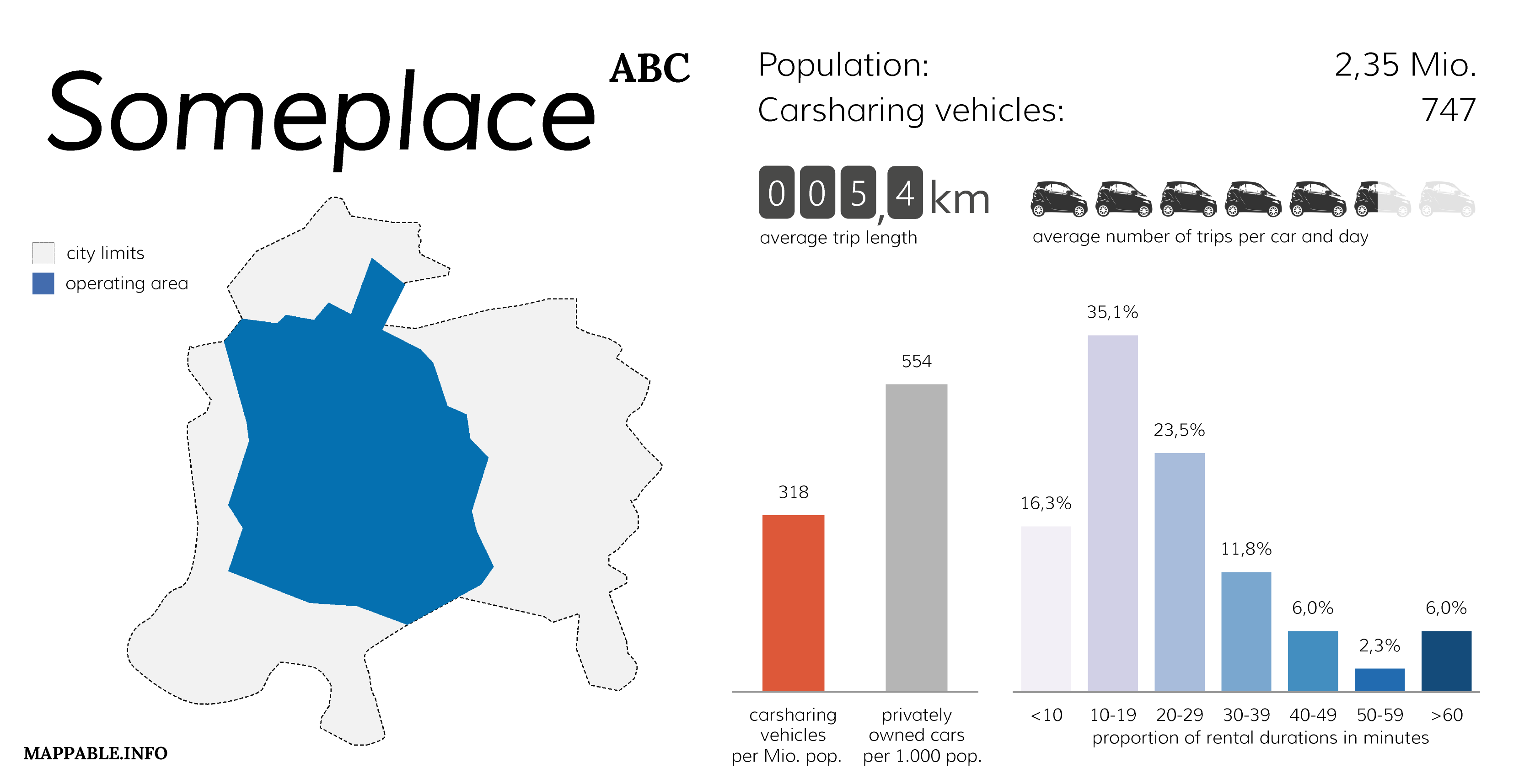
One of our first steps for analyzing the data was building a dashboard which contains the key facts about carsharing usage in every city. These visualizations provide a brief and clearly arranged profile of how carsharing is used in the individual cities. Second, if you compare different cities to each other, they serve as a tool for identifying patterns, similarities and contrasts that are hidden in the data set.
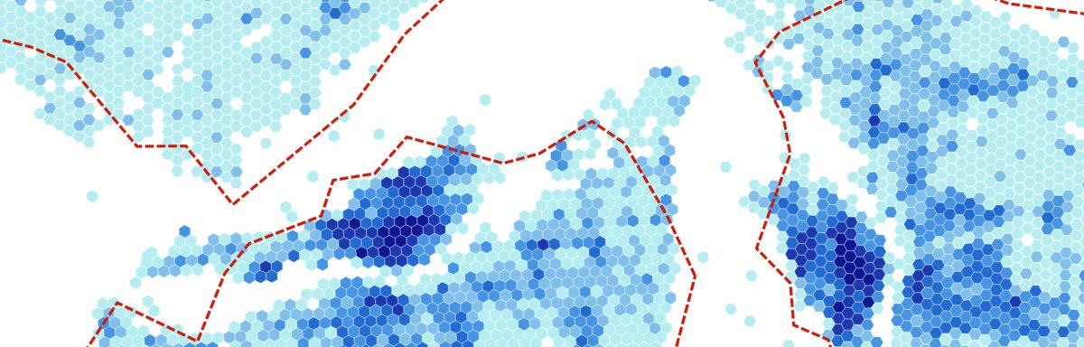
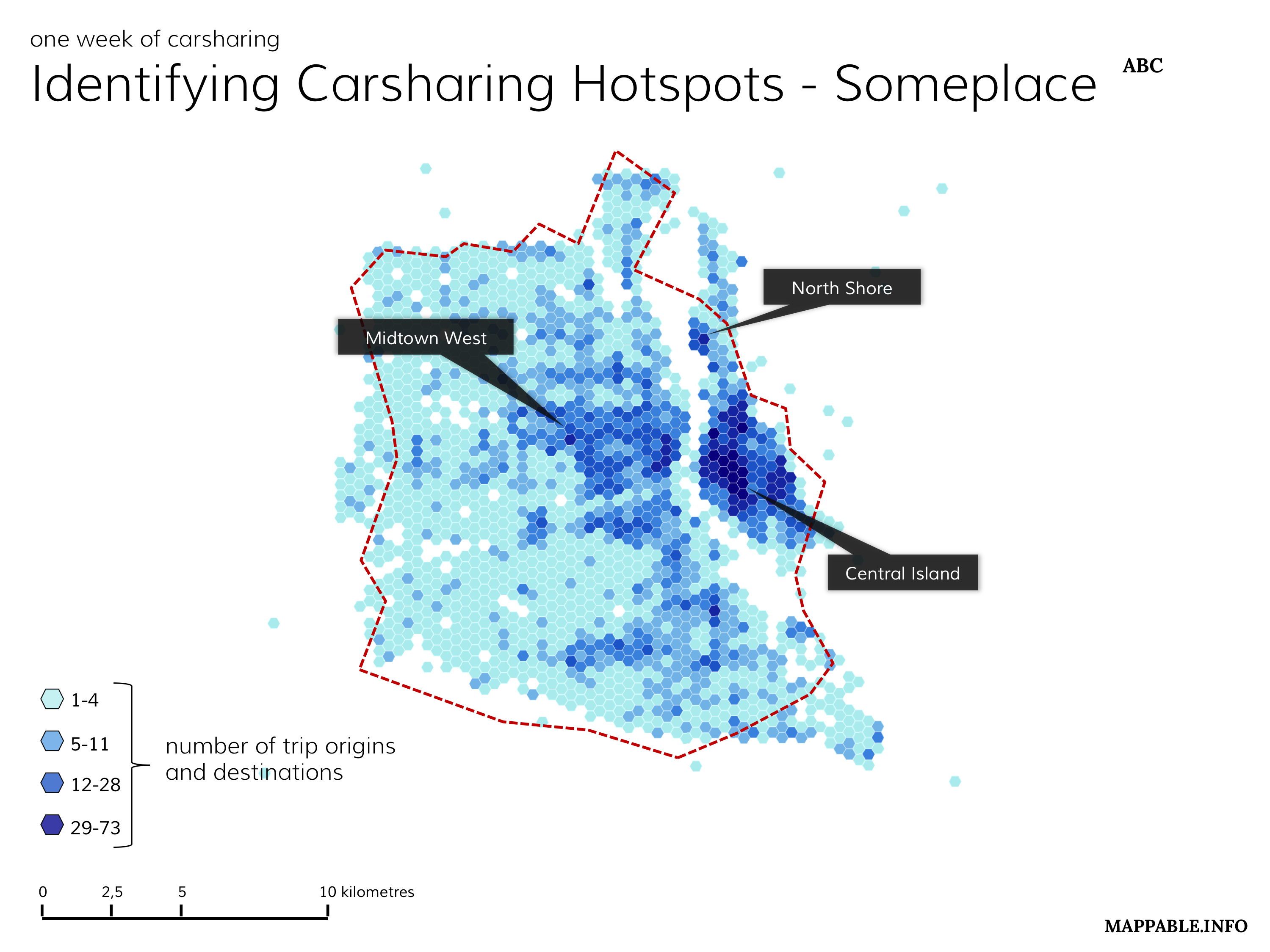
Since all our data is spatial what would be more obvious than visualizing it on a map? We therefore continued our project by identifying and displaying the hot spots of carsharing usage on a hexagonal heat map. We took inspiration for those maps in the beautiful visualizations of tree density in Vienna by Anita Graser.
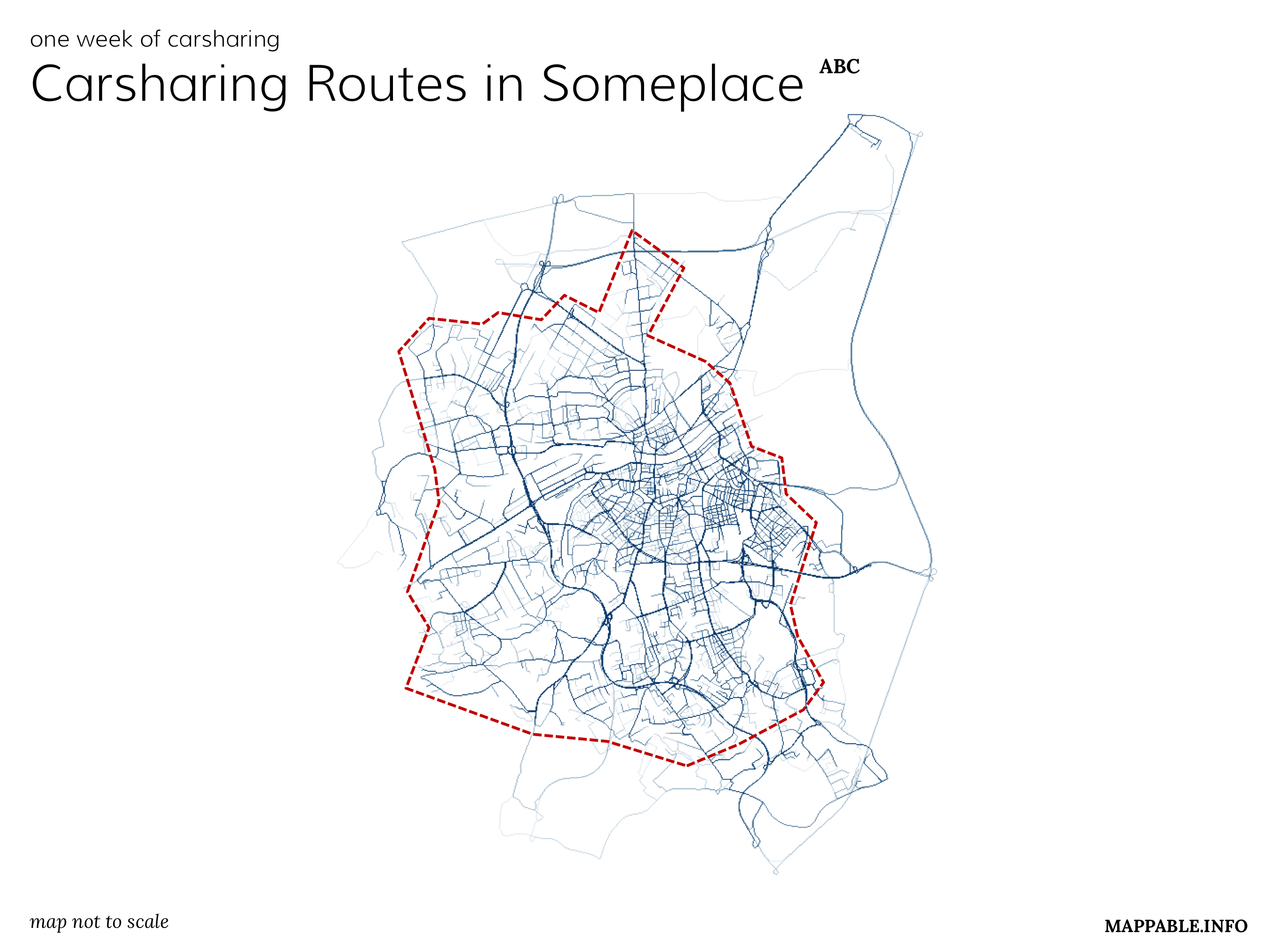
Next, we were trying to get an impression, which are the most frequently taken routes. Since we only had the start and end points for every trip, we used an open routing service to create route geometries for every trip in our database. Creating an overlay of all the trips resulted in a map showing the amount of traffic generated by the car2go cars.
Conclusions
So, what did we learn from this project? Well, unfortunately we were just scratching the surface when we had to stop the project. We still think that there’s a huge potential in data sets like the one we worked with here. There’s so much we could learn from further analytical steps: more insights about how movement patterns in cities look like, about the acceptance of alternative mobility concepts, about similarities and differences in individual cities, just to name a few aspects. But we have to accept the fact that openness of data is still a critical topic for many companies. Even when it’s people like us, who generally support the concept of carsharing and who are just playing with the data in their free time.
Behind the Scenes
Finally, we want to give you some insights into the software and methods that we used to collect and process the data.
Scraping / Data collection
Car2go offers an API for registered developers of third-party-applications. At the same time, the map that you can find on car2go’s official landing page is drawing it’s data from this API too. The data set contains the location of all currently available vehicles, their licence plate, the internal vehicle identification number, the fuel level, the cleanliness inside and outside as well as the engine type (in some cities there are electric vehicles).
What we did to collect the data, was simply writing and running a small Python script that accessed the official homepage every 60 seconds and wrote the map’s data into a database. The script does nothing else than a web browser when accessing the same URLs. We could as well have sat down for a week and taken turns in saving the files by hand. There was no ‘hacking’ involved in this process at all.
Data management
To store the data we used the PostgreSQL database system, which we extended with the PostGIS plugin to use it’s ability to save spatial data and process spatial operations. The database was accessed directly by Python-script using the Psycopg2 module.
Routing
To not only show the locations of all the vehicles but individual rides or rental cycles, it was necessary to further process the raw data: when a car disappears from the map at one location and reappears an hour later at a different location this results in a pair of coordinates as the source and destination points for a ride. Given the by-minute pricing model of the car2go-system it seems reasonable to assume that the majority of users take the fastest route between origin and destination.
To derive the most likely route between the points of origin and destination we used the free to service of open.mapquest.com. It is quite similar to the routing functions of google maps and other competitors but uses data by the openstreetmap project. The actual process of generating routes is similar to the scraping of the raw data. We build an URL which includes start and end coordinates as parameters and pass it to open.mapquest.com. The service responds with a XML file which includes the geometry of the route and meta data similar to a route planner.
Analysis & Visualization
For the analysis part we didn’t just rely on one single program, but used a range of different tools. For many tasks we have used the Microsoft Office environment. We could have used open solutions for most cases too, but after all these are the programs we use professionally and are most trained in.
- MS Access to connect to the PostGIS database, the definition of queries and export of aggregated subdatasets to other programs
- MS Excel for creating charts and the info tiles for the individual cities
- QuantumGIS for cartography – especially because of the easy way to connect and work on PostGIS datasets (and apart from that it’s way more fun to use than ArcGIS)
- Adobe CS for some additional styling of charts and map