About this map
If you love traveling like I do, then you might sometimes wonder “How much of the world have I actually seen? How many countries, cultures & cities are out there, that I haven’t explored yet?” To keep track of our trips and as a nice piece of wall decoration – at least for map-aficionados – we’ve got a nice old fashioned world map with pins marking every place we’ve visited hanging in our living room. (BTW: The header of the blog shows a detail of this map)
But what about the digital world? Some time ago, I was searching the web for an interactive map, serving the same purpose: giving you a beautiful visualization of all the places you’ve been to. To my surprise, I couldn’t find anything even close to what I was looking for. This is why I decided to build this map and release it to the public.
Get your travel score
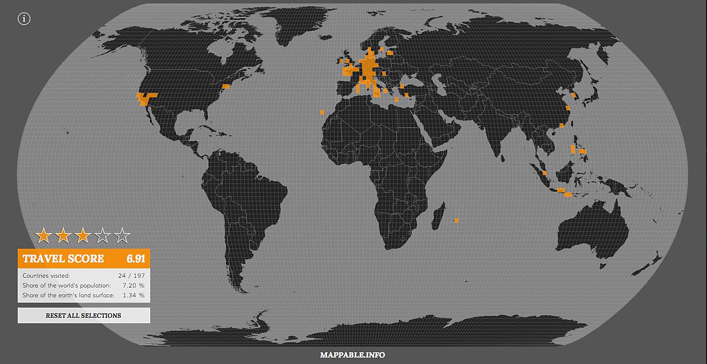
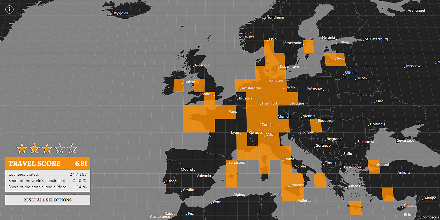
The basic idea behind the map is quite simple. It divides the earth into graticular blocks with a size of 2×2 degrees. By selecting those cells that you’ve already visited, the application calculates:
- how many of the earth’s 197 countries you’ve visited
- the share of the world’s population that lives in the selected areas
- the share of the earth’s land surface that lies inside the selected cells
The overall travel score is calculated as the mean of these three parameters. Of course this calculation method is kind of arbitrary. It’s just my approach to measuring how much of the world a person has seen.
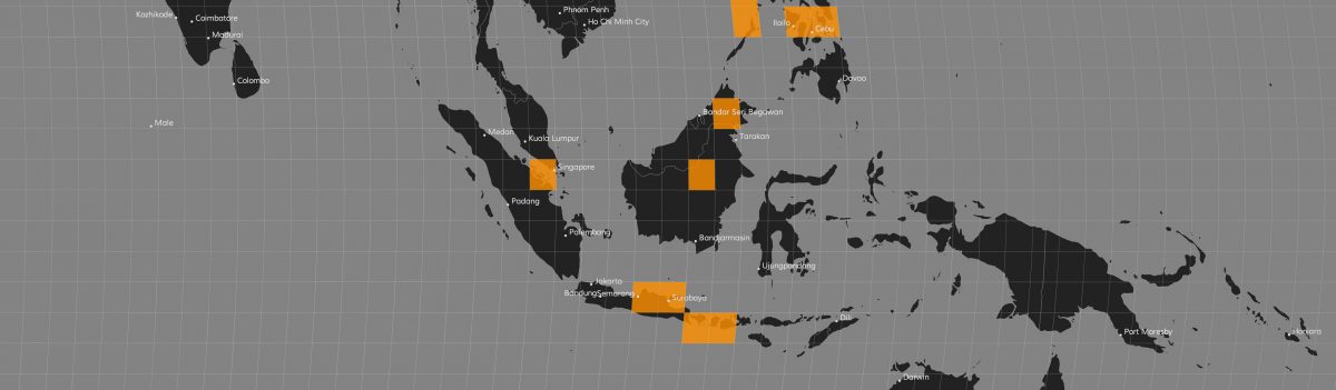
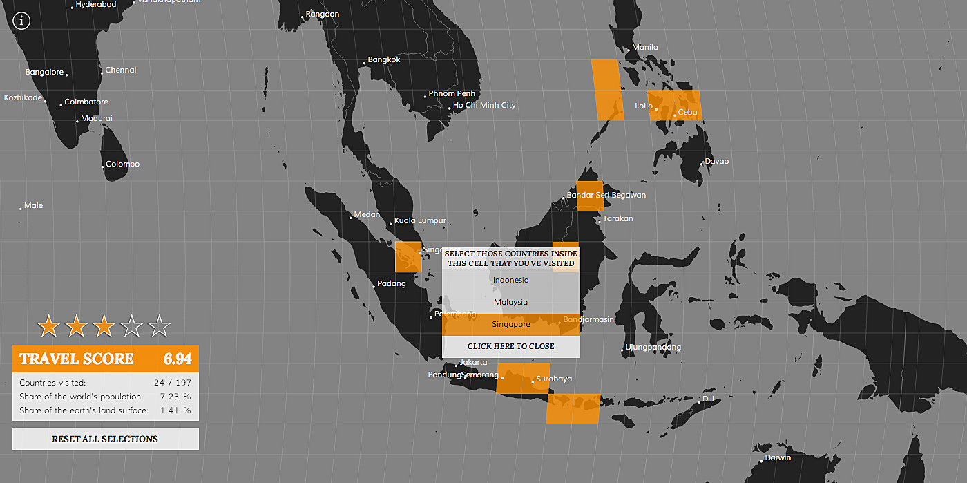
If you want to get your personal travel score and map, just click here or on any of the images to access a full-sized, interactive view. Selecting a cell is as easy as clicking on it – click again to deselect it. To zoom in use the mouse wheel or the pinch gesture on touch devices. Finally, if you click on a cell which comprises more than one country, a pop-up will appear which prompts you to select those countries inside this cell that you’ve visited. If you are interested in the technical details behind this projects and the datasources just continue reading below the images. But for now: have fun exploring the interactive travel map.
Please note, that this map is not optimized for Internet Explorer or older browsers in general. There might as well be problems on less powerful or mobile devices, as the visualizations takes heavy use of SVG in browser rendering.
Realization & data sources
To build this map different geographic data sets were necessary. Here’s the list of sources I’ve used:
- State boundaries by Natural Earth – 1:50m Cultural Vectors – 197 sovereign states, v. 2.0.0 (2012) – link
- Place labels by Natural Earth – 1:110m Cultural Vectors – Populated places, v. 2.0.0 (2012) – link
- Population data by CIESIN at Columbia University – Population Count Grid Future Estimates, v3 (2010) – link
- Land area data by CIESIN at Columbia University – Land and Geographic Unit Area Grids, v3 (1990, 1995, 2000, 2005, 2010, 2015) – link
Collecting these data sets was followed by some geoprocessing steps which I performed in QGIS. First I generated a vector grid with an interval of two degrees. After that, I transformed the population and land area data, which are provided in raster format, into polygons and aggregated the data on a 2×2 degree resolution. As a final step I then attached this information as well as the state boundaries to the vector grid polygons by spatial join operations.
By then I had all the necessary data at hand and could go on making the whole thing interactive. I chose to tackle this challenge with D3, which is more and more becoming the standard for dynamic data visualizations and has a lot of smart built-in mapping functionalities. As my application is built for the web, loading time and file size are crucial. Unfortunately, my data set consisted of over 16.000 polygons with a size of 7.5 MB in the ESRI shapefile format. By using Mike Bostock’s TopoJSON I managed to reduce file size to 1.8 MB. After loading the data, next was adding all the interactive functions. I found a demo that helped me better understand pan & zoom functionality in D3. Afterwards, I built some custom functions: for calculating the results, for generating pop-ups when the selected grid cell comprises more than one country, for the reset button and for the lightbox stlye information note which is triggered by a button in the upper-left corner. Finally there’s a solution that automatically adjusts the map to full-size, depending on the current window dimensions, based on this example. It would lead to far to explain all this here in detail, but if you are interested in taking a closer look, just check out the source code of the interactive map on github.
Leaving for a dataviz / cartography journey
Finally, a short personal notice. Besides building maps / applications like this one, I still love to travel. I’m currently making plans on becoming a kind of dataviz / cartography journeyman (reference to the traditional concept of journeymanship intended). I dream of leaving for a year or two, travel around the world, get to know many different cities, cultures and people and improve my professional skills at the same time. I imagine staying at different places for one to three months each time getting in contact with the local dataviz, open data, data journalism (…) community – always learning new stuff, helping out on projects as a freelancer or maybe giving some workshops. I haven’t yet decided where to start the journey and which places I want to visit but I’ll write a blog post when my plans are getting more concrete. In case this doesn’t sound completely foolish to you and you happen to need someone to help out on a particular project or if you can imagine me temporarily joining your GIS / cartography / dataviz / data journalism company, or simply have a suggestion which place I definitely shouldn’t miss, just contact me on twitter @PatrickStotz or by mail: mappable(at)gmx.de.