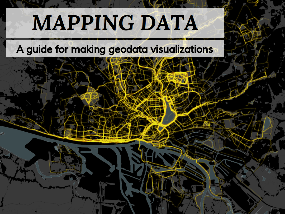
Yesterday we’ve had the pleasure to hold a presentation at Netzwerk Recherche’s Jahreskonferenz. Germany’s most important investigative journalism conference. The aim of our session was to give guidance to (data) journalists and went by the title: “Mapping Data: So gelingen Geovisualisierungen” (“A guide for making geodata visualizations”).

You can take a look at our presentation by clicking one of the links below (we’ve made a German and an English version)
GERMAN VERSION I ENGLISH VERSION
As an add-on to our presentation we produced two more things, that some of you out there mind find helpful too:
- Mappable Toolset: The number of tools to process data, make maps, interactive visualizations etc. is continuously growing. While we love new tools, this leads to a situation that makes it quite hard to keep an overview of which tools are good for a certain tasks, where to find them and how much they cost. To keep track of the tools we’ve used so far and as a guide for others we thus collected our toolset. Have a look at it here: English version, German version.
- Mappable Cheat-Sheet: Making maps and other visualizations with a geospatial component is certainly not a trivial tasks. There are many pitfalls, take alone spatial reference systems as an example, that might completely mess up your visualization if you don’t handle them correctly. We thus created a checklist for making geodata visualizations in (data-driven) journalism. You can find it here: English version, German version.