Analogue Mapping

A few weeks ago I stumbled across a Youtube video in which a globe was cast out of cement and then painted. I’ve been thinking about making my own globe for quite some time (not just since I’ve known the great globes from Bellerby Globemakers in London), so I tried my luck.

freshly cast globe

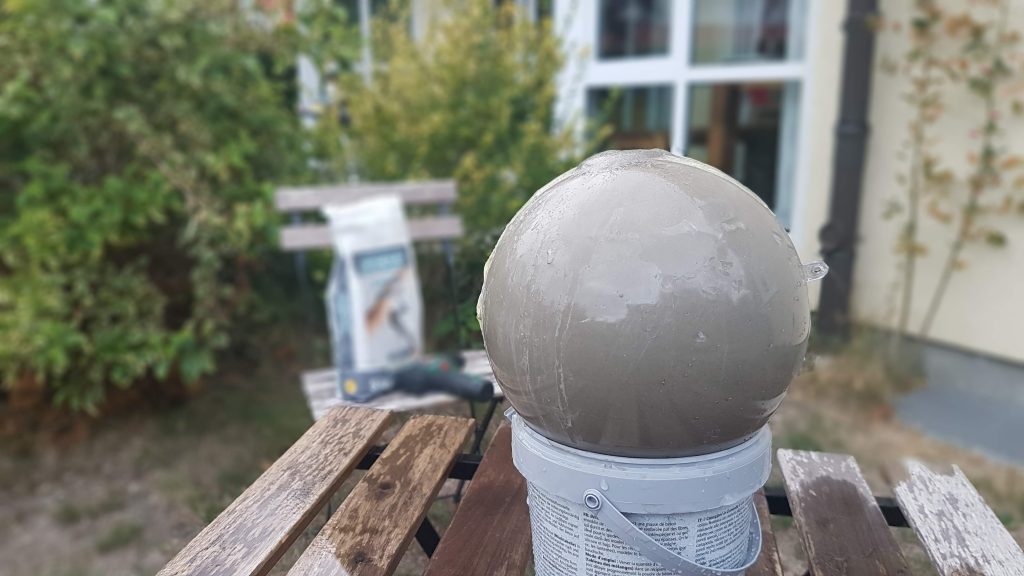
In the first step of the process, I greased the mould of a Christmas tree ball from a craft shop and filled it with fresh cement through a hole in the upper part.

dried cement still inside half of it’s mould

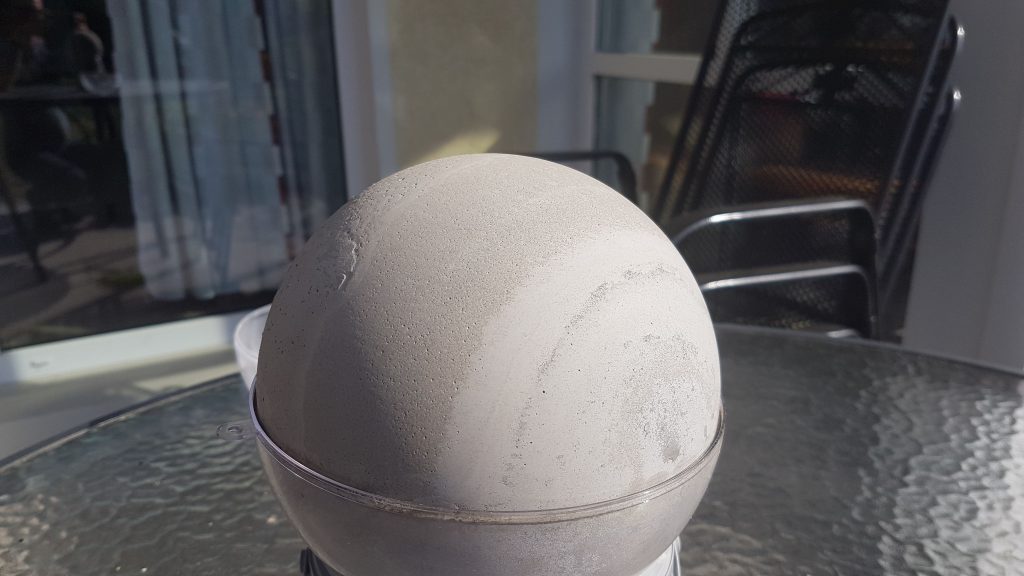
Due to the material of the mould, the drying process took a very long time. Only after about one day could I remove the upper half of the mould and let the globe dry well. The texture of the sphere reminded me a little of Jupiter or Neptune – maybe a good idea for the next project.

paper stencil
stencil detail

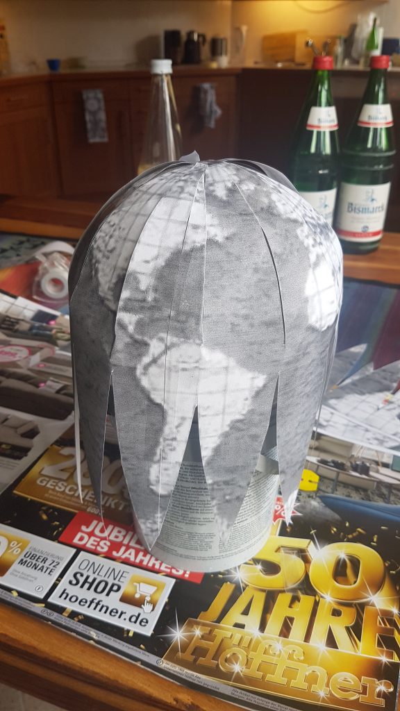
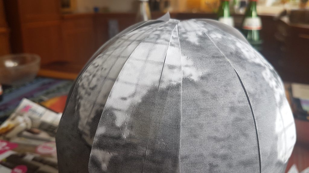
Every cartographer knows that it is not easy to bring the continents that exist as a sphere into a flat projection. The other way around, too, you have to do some tinkering. It was nice to find some templates for paper globes on the net, which I could then print and transfer as well.

transfer work

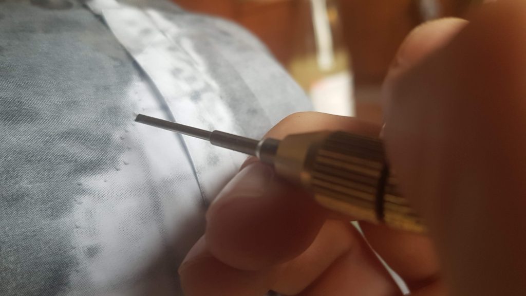
At first I tried to draw the continents through the paper with a pencil, but it didn’t work well. So I decided to use a thin screwdriver to scratch the not yet completely hard cement. This worked surprisingly well.

copper paint job

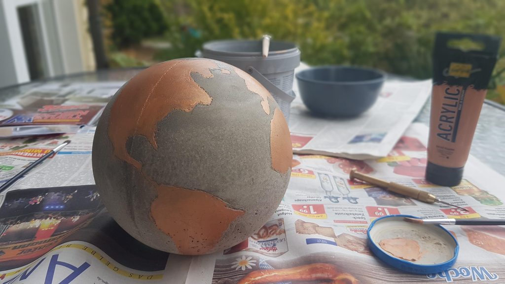
In the end all I had left to do was to paint the continents with an acrylic paint. I decided to use copper, which goes well with the mottled grey globe. The finish was a layer of clear varnish over the ball, because the cement was still a bit crumbly to the touch.

the final globe

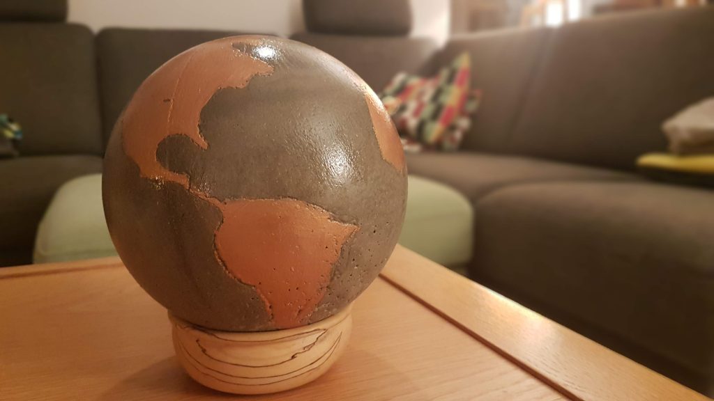
I’m quite happy with the final globe (the clear varnish is now much matter than in the photo above), even though it can’t compete with a purchased product. But it was a great fun and maybe I’ll build some more and improved versions sometime.
Since there were some questions: It weighs about 1,5 kg and cost about 20€ of material (cement, shell, acrylic paint and clear varnish).

drone mapping

Drones are fun… It is hardly news that cartography and remote sensing are moving away from heavy payload carriers such as airplanes and helicopters to smaller, unmanned systems. Commercial UAVs are now used in all kinds of sectors, not just the military.

I have been flying a DJI Spark for a few months now and I’m quite surprised at the quality of this small consumer drone when it comes to mapping. In this blog post I want to outline the drone, my workflow for processing the images and the resulting 3d maps.

With a take-off weight of approx. 300 grams, the Spark is the lightest and smallest drone of the consumer market leader dji from China. I often take it with me in a small backpack and take it out spontaneously for a flight. Flight preparation takes only about one minute: You boot the drone, then the remote control and connect your phone or tablet to the remote control.

To create a 3d scene, I fly several times around the object of my interest in a constant height and take about 50 photos. The Spark has a flight time of approx. 15 minutes per battery pack, whereby you have to subtract take-off and landing and achieve a realistic duration of 12 minutes per flight. This is sufficient to fly around even complex objects. The battery pack is easily exchangeable (I bought 3 packs so flight time is usually not a problem).

Back home I check the pictures first and delete blurred pictures manually. Then I use 3DF Zephyr, a software to reconstruct 3d models from pictures or videos. The software is quite simple, but has powerful features. Up to 50 images can be loaded and processed in the free version. In contrast to software, which I used in the past, you don’t have to manually set fixed identification points between images any more. The complete reconstruction is fully automatic. At the end, different products such as point clouds, meshes or textured models can be exported. A nice feature is the direct integration into Sketchfab, a service for hosting 3D models on the web.

Sketchfab offers the possibility to manually adjust lighting, color and contrast to create a video game like style for the models that I believe has a nice effect while still providing enough detail about the object.

Of course, not only 3d models are valuable results of a drone flight. Often it is more interesting to create orthophotos from the individual images. I intend to have a look at the Open Drone Mapping Project in the coming months and will report on the results.

Until then: Happy flying!

its / db mobility hackathon 2017

Our team consisting of four civity analyst took part in the DB / ITS Hackathon in Hamburg on Friday / Saturday and won the first place quite unexpectedly…

On a hackathon, a programming project / data analysis has to be developed from the idea to the prototype within 24 hours. We opted for the relatively current topic of “storm susceptibility of the rail infrastructure due to falling trees”. We used a combination of different methods and open datasets to create static and interactive maps to identify hot-spots within the German rail system in general and the Hamburg system in particular.

Storm risk analysis of the German railway system. Red and yellow lines indicate a heightened risk for trees falling onto the railway tracks.

You can find the finished project here: http://46.101.153.57/ 

Pictures and further information can be found at: https://dbmindbox.com/db-opendata-hackathons/hackathons/hamburg/

mapping in deep space

Credit: ESA/Rosetta/NAVCAM, CC BY-SA 3.0 IGO

Landing the fridge-sized probe Philae on 67P/Churyumov-Gerasimenko was without a doubt one of the most fascinating achievements of science and aeronautics this year. We were glued to the screens during the dramatic hours that followed the landing and impressed by the stream of pictures arriving from this distant and unexplored world. The European Space Agency (ESA) did a great job not only with the mission but also by using a Creative Commons License to publish the pictures of the comet.

3d-Mesh of the comet in 123D-Catch

This gave us the possibility to create a 3D-model of the first landing site. Admittedly the ESA published a complete yet low-resolution 3d-model of the comet a few weeks ago but we wanted to try some software anyway: Using 123D Catch from Autodesk we stitched the pictures together and created a meshed and textured *obj file which we then uploaded to Sketchfab. Although not perfect we were impressed by the results. The process is quite simple and we will surely use it on more down-to-earth mapping projects in the future. 

mappable at the nr-conference

Yesterday we’ve had the pleasure to hold a presentation at Netzwerk Recherche’s Jahreskonferenz. Germany’s most important investigative journalism conference. The aim of our session was to give guidance to (data) journalists and went by the title: “Mapping Data: So gelingen Geovisualisierungen” (“A guide for making geodata visualizations”).

You can take a look at our presentation by clicking one of the links below (we’ve made a German and an English version)

GERMAN VERSION I ENGLISH VERSION

As an add-on to our presentation we produced two more things, that some of you out there mind find helpful too:

  1. Mappable Toolset: The number of tools to process data, make maps, interactive visualizations etc. is continuously growing. While we love new tools, this leads to a situation that makes it quite hard to keep an overview of which tools are good for a certain tasks, where to find them and how much they cost. To keep track of the tools we’ve used so far and as a guide for others we thus collected our toolset. Have a look at it here: English version, German version
  2. Mappable Cheat-Sheet: Making maps and other visualizations with a geospatial component is certainly not a trivial tasks. There are many pitfalls, take alone spatial reference systems as an example, that might completely mess up your visualization if you don’t handle them correctly. We thus created a checklist for making geodata visualizations in (data-driven) journalism. You can find it here: English version, German version.