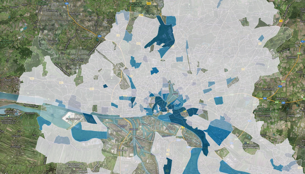
Finally, I found some time to continue working on my mapping tourism project. The first map I published some weeks ago displayed, as you might remember, every hotel & hostel in the city of Hamburg. The map hereby enabled the viewer to get an impression of the spatial dimension of tourism at a glance. Not bad as a starting point. But one of the main reasons tourism has become a topic of public interest in Hamburg recently, is the complaint by some inhabitants that growing tourism is becoming a problem in their neighborhood for various reasons (e.g. noise, traffic, littering). To address these issues too, it was necessary to include an additional aspect in my visualization: population. I’ve thus made a second map, which shows the ratio between inhabitants and tourists on a fine-grained level – in my eyes a very good indicator how ‘touristy’ an area is.
It was’n quite easy to find publicly accessible data for the map. The smallest existing tract shapes (German: statistische Gebiete) are provided by the city of Hamburg, which has opened up this data set as part of their recent open data initiative, which of course is a good thing. The down side is, that this data set is only available via an WFS-Server. A technique, which is not really suitable if you aim at opening up data for the average user. The population data comes from an official publication by the city of Hamburg, which unfortunately is only available as a pdf-Version, which meant quite some work for me to extract and process the data.
Finally having the data sets at hand, I calculated the number of tourists per area by spatially joining the hotel locations to each tract and counting the sum of provided rooms. The final visualization is once again done in CartDB – this time by using their API, which is way more flexible and allows you to integrate things like a switch between satellite-view and map-view. The final map makes it easy to see which are the most touristy parts of town (marked in blue). You can explore the interactive map by clicking here or on the preview picture below. Both lead to the updated project page, where I also added a new project summary (completely in English now).
