What’s your Travel Score?

Today we’re releasing a new project: Travel Score. It’s an interactive map which, by selecting those areas of the world that you’ve visited, calculates how much of the earth you’ve already explored.

The geographic data, gathered from Natural Earth & SEDAC/CIESIN, was processed in QGIS and finally visualized in D3 for making everything interactive. The project page includes a detailed description of the way everything works and how I’ve built the map as well as some words about the dataviz / cartography journey I’m currently planning. Or if you, like most of the people on the web, are just interested in the fancy, interactive content, take this shortcut to reach the full-sized, interactive version of the map or simply click on the image.

nonvoters 2013

We’ve received a lot of (mostly positive) feedback for our last project “Atlas der Nichtwähler / The Geography of Nonvoters” which visualized the spatial distribution of nonvoters for the German federal election in 2009.

One weakness of the presentation was the lack of information about the relative number of nonvoters for each voting district. Basically, by mapping every nonvoter we produced a map which looks almost the same as a visualization of the current population density.

As a consequence we’ve decided to vary the style of our map for the results of the 2013 election by additionally displaying the percentage of nonvoters for each district by diverging colors.

The results are quite interesting: More than two decades after the reunification there is still a significant gap between voters in the eastern and western parts of Germany. Especially rural parts of eastern Germany have a considerably low turnout. This is sad but in no way surprising given their demographic, economic and social situation. The refusal to cast a vote is directly connected to factors like wealth and education. The suburban regions around cities like Berlin, Hamburg or Munich therefore show higher turnouts.

Interesting and somehow surprising is the fact that some counties in Bavaria had quite low turnouts as well. Maybe voters were overly convinced that the CSU-party (who received over 50 % of the votes in Bavaria) would win anyway.


new project: the geography of nonvoters

The German election campaign steps into it’s final phase. On September 22th the Germans will elect their new Parliament.

During the weeks before the election maps, graphics and data visualizations are probably more widespread in the media than at any other time. Consequently there’s a peak in the demand for data driven journalism every four years. We want to contribute to the coverage and therefor release a map that focuses on one single aspect: the nonvoters of the last federal election.

The basic idea behind our map is to raise awareness to the number on nonvoters by visualizing turnouts for certain areas in another way than by the ordinary choropleth map. Our focus is not on the percentage of nonvoters but on the sum and spatial distribution of individual persons that did not vote.

That’s why we chose to use a dot density map, displaying one point for every ten nonvoters during the 2009 election. For our home state Hamburg we were able to get more detailed data and realized a second version with higher zoom levels, displaying one point for every single nonvoter. Of course the points do not represent real persons and their home address. Moreover, the exact location of every point was determined by a random distribution of all nonvoters in each district. For a closer & interactive look at our maps, as well as on how we realized them, take a look at our project page. 

Mapping Tourism – Identifying Hamburg’s most ‘touristy’ areas

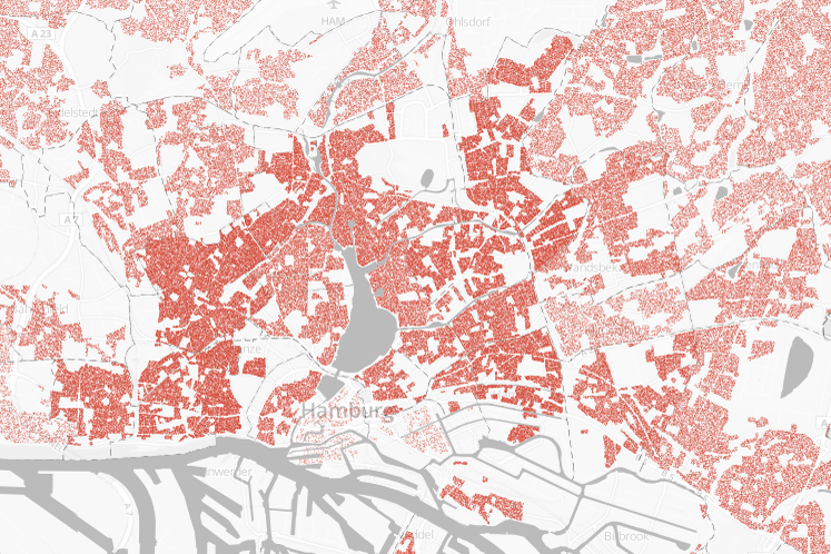
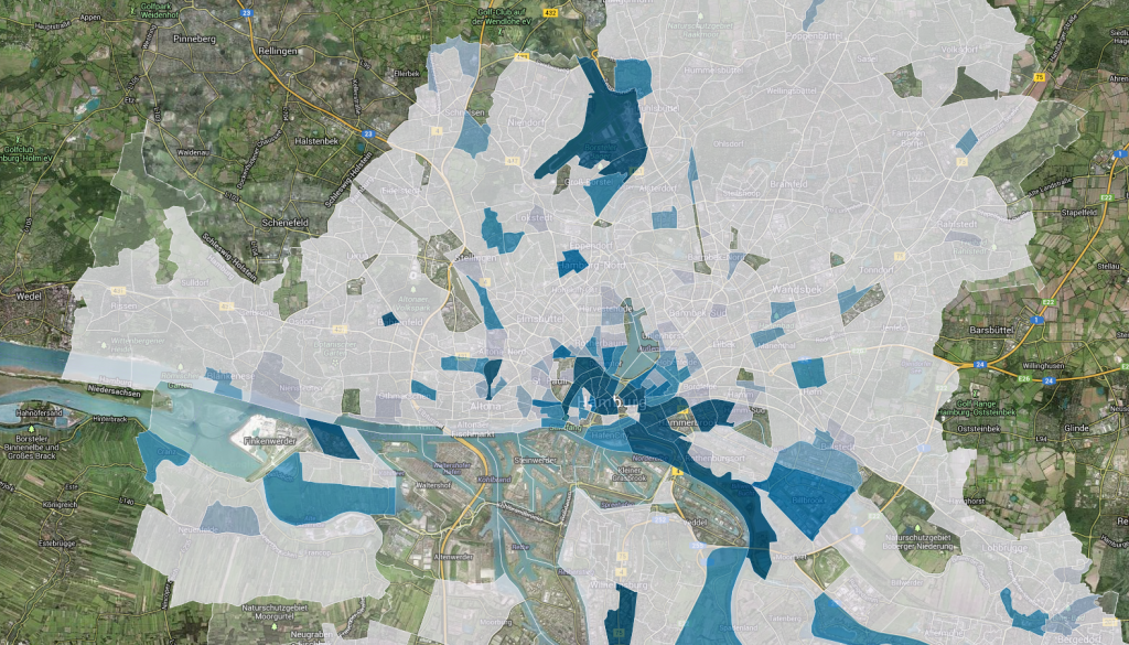
Finally, I found some time to continue working on my mapping tourism project. The first map I published some weeks ago displayed, as you might remember, every hotel & hostel in the city of Hamburg. The map hereby enabled the viewer to get an impression of the spatial dimension of tourism at a glance. Not bad as a starting point. But one of the main reasons tourism has become a topic of public interest in Hamburg recently, is the complaint by some inhabitants that growing tourism is becoming a problem in their neighborhood for various reasons (e.g. noise, traffic, littering). To address these issues too, it was necessary to include an additional aspect in my visualization: population. I’ve thus made a second map, which shows the ratio between inhabitants and tourists on a fine-grained level – in my eyes a very good indicator how ‘touristy’ an area is.

It was’n quite easy to find publicly accessible data for the map. The smallest existing tract shapes (German: statistische Gebiete) are provided by the city of Hamburg, which has opened up this data set as part of their recent open data initiative, which of course is a good thing. The down side is, that this data set is only available via an WFS-Server. A technique, which is not really suitable if you aim at opening up data for the average user. The population data comes from an official  publication by the city of Hamburg, which unfortunately is only available as a pdf-Version, which meant quite some work for me to extract and process the data.

Finally having the data sets at hand, I calculated the number of tourists per area by spatially joining the hotel locations to each tract and counting the sum of provided rooms. The final visualization is once again done in CartDB – this time by using their API, which is way more flexible and allows you to integrate things like a switch between satellite-view and map-view. The final map makes it easy to see which are the most touristy parts of town (marked in blue). You can explore the interactive map by clicking here or on the preview picture below. Both lead to the updated project page, where I also added a new project summary (completely in English now).
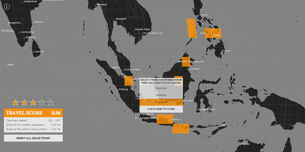
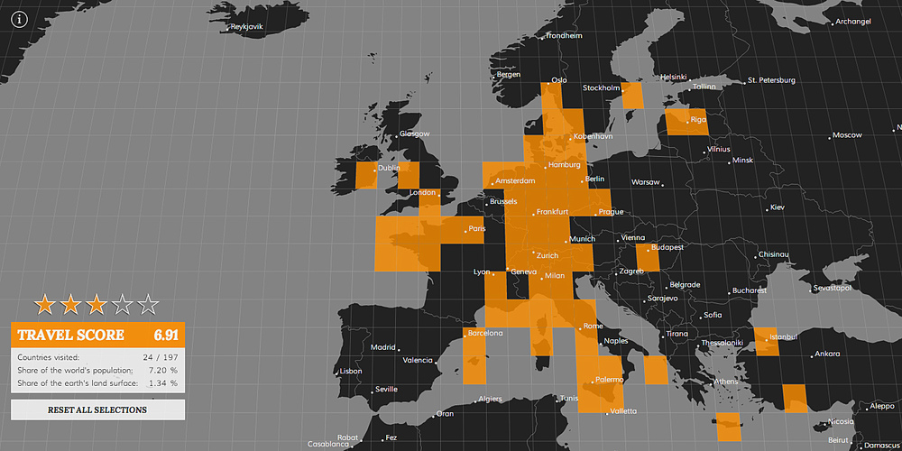