Scrollytelling with MapboxGL & waypoint.JS

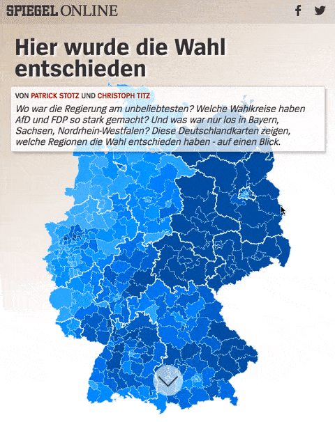
Back in September, we published this scrollytelling map covering the German Federal Election on Spiegel Online:

I want to share a few thoughts about it because we did some things differently on this project:

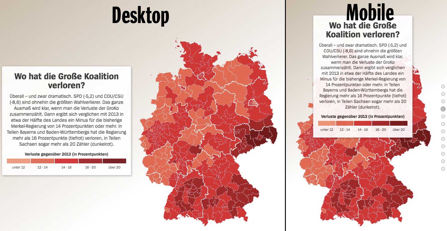
Most importantly, we decided to explain the election results to our readers solely by guiding them through a series of annotated choropleth maps. Chapter by chapter, maps and text side by side but without any interaction, except moving on by scrolling. Of course, there was a dashboard-like view on our site while the results came in on constituency level. But we wanted to give more context. Really explaining what happened where by pointing out pivotal points for different parties and regions. Making the most of the spatial information contained in election data by knitting together maps and story and really guiding our readers.

Why using MapboxGL

The basic principle of the map is very simple. Constituencies are shown in a series of choropleth maps (based on different properties and thresholds), with occasional labels and viewport changes.

Out of the various options to realize this setup, we chose MapboxGL, using WebGL for the first time in one of our projects.

This approach offered several advantages over the classic pre-rendered map tile workflow. Most importantly, the vector data setup allowed us to use a single data set (containing all necessary information on a constituency level as feature properties), rendering the different styles for each slide/map on the client side. This lead to reduced file size (vector data has to be queried only once) and made updating data during election night very convenient.

Additional benefits when using MapboxGL where the smooth zoom animation and freely defined zoom levels, that fit the bounds on devices of different size. A small downside was, that we had to build a fallback option for readers with outdated browsers or devices.

Scrollytelling tools FTW

In order to build a story out of the individual maps and the accompanying text, we needed a solution that kept both elements close together. Luckily there are various scrollytelling libraries for this purpose that make position handling and derived interactions in JavaScript really easy. This blogpost by Russel Goldenberg is a great overview of the different options and their pros and cons.

We build our project based on waypoints.JS and put our text in boxes of up to roughly 500 characters each (+ HTML-legend) that scrolled on top of the sticky map. On wider displays the text moves to the side, customized by a few simple CSS media queries.

Workflow

Of course, a project like this can’t be put together on deadline without preparation. I started building a prototype around two weeks before the election. The underlying data came directly from the German Federal Returning Officer who released constituency geometries upfront and preliminary election results in a pre-defined format during election night. All that was left to do during the election night was defining the storyline, styling individual maps, writing the text sections (my colleague Christoph Titz helped me out with that) and putting everything together. I won’t claim it wasn’t stressful, but the map was finished around seven hours after we had gotten the preliminary results.


Let’s start blogging again

It’s been quiet here on mappable for much too long (891 days to be precise, this a data nerd blog after all). A lot of things changed since we first got started with mappable in 2013/14. Back then Mapbox and CartoDB were still brand new startups, we had all just stopped talking about google fusion tables and mapping mashups (remember that?) and putting election results on an interactive map was top notch data journalism.
A lot things changed since then. Like so many others in the field of (geospatial) data analysis and visualization, what started as a fun project in our free time grew into ordinary full-time jobs. We’re now both members of Spiegel Online’s data journalism team and Achim is leading a small data team at Hamburg/Berlin based consultancy Civity.
Unfortunately, spending all day crunching data also ment we’ve stopped write about our work here in our free time. Like a lot of other blogs, mappable.info got silent exactly the moment we’ve made most progress and probably had the most interesting work to share. Being career changers our selves and having learned so much from the open spirit in the geospatial, open source, open data & dataviz communities this is something we want to change again. We probably won’t start bigger projects here but we’ll do our best to write blog posts here every once in a while to keep you updated what we’re working on these days. Stay tuned, there’s more to come soon.

Patrick & Achim

BTW: We’ve switched our web hosts. The blog now runs on wordpress (not too happy about the move though, but we just don’t want to waste time with that any more). We’ve done our best to keep projects up an running, but there might still be some small issues and dead links.

Spinning globe with glowing city markers in D3

D3 (Data-Driven Documents) is not only one of the currently leading dataviz tool, it also has huge capabilities when it comes to mapping. Here at mappable we’ve so used it for building Travel Score and the Berlin A-Z maps. D3 has a quite steep learning curve, but since I’ve successfully worked with it while only having very basic JavaScript knowledge at that time, it’s definitely doable and in my eyes well worth the effort.


Not having used D3 in quite a while and a little worried that my skills would turn rusty soon, I was pleased to find this tutorial by Curran Kelleher in my twitter feed the other day. It’s a great introduction into D3 and was a welcome opportunity for me to kick start working with D3 again. Close to the end of his tutorial (here), Curran shows how to draw a world map in D3 simply by plotting graduated circle markers according to their lat/long coordinates using Geonames data. I instantly liked the idea and though it would be a good exercise to give the visualization a few additional touches, making use of D3’s extensive mapping functionalities.

First of all, I decided to use D3’s build in orthographic projection. With just a few twists and configurations I had a beautiful globe instead of a flat map. Next, I wanted to get that globe spinning. Why? Basically, because spinning globes are totally fascinating and look awesome! Again, this can be done by adding just a few lines of code.  There’s a great example by Mike Bostock showing the basic principle, which I adopted. Finally, to add some simple interactivity, I’ve integrated some HTML5 sliders and a color picker with the corresponding event listeners.

All together this gives us a spinning globe, showing all cities in the GeoNames databast with a population of more than 100.000 and handlers to manipulate rotation speed & direction, marker opacity, size & color. The result might challenge the rendering capabilities / the processing power of your computer, since it constantly re-calculates and re-projects the positions of over 4.000 markers on the globe. Looking at my machine (a 2013 MacBook Air) that amount is probably at the limit of what you should do with SVG transformations. If you want to build something bigger, working with either canvas or WebGL might be a good idea (see this OpenViz conference talk by Dominikus Bauer for a proper explanation).

Anyway, I’m quite happy with what I’ve build and wanted to share it, since I’ve learned so much just by looking at all the awesome examples out there.

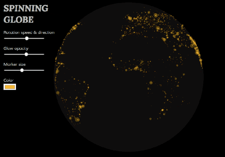
The globe visualization and the source code can be found here or by clicking the image. I decided not to embed it into the blog post, but to use a animated GIF instead, since it could lag or crash browsers on weaker machines. Please also note that the visualization is only optimized for Chrome browsers. I didn’t invest any time in cross-browser compatibility.

Have fun playing with it and happy mapping with D3!

Mapping nightlife

After collecting business listings of relevant categories (nightlife, cinemas, theaters, and event locations) from a popular online directory, the requirements for mapping them were twofold:

  1. The visualizations should allow to identify hot spots of nightlife activity in each city on different map scales.
  2. They should be suitable for comparing the distribution patterns between the different cities.

We chose to tackle this challenge with static dot density maps (sometimes also called dot distribution maps), produced in QGIS. If a data set is large enough, this approach offers a much higher precission than the ordinary choropleth map or any kind of raster or hexbin map that aggregates the data. For the map styling we used cartoDB’s new Dark Matter basemap (finally a project with a good reason to chose the ever so popular dark map style) and plotted all locations on top of it. We set the circle size to 1250 meters and used a very low opacity level as well as the feature blending mode ‘screen’ to highlight those places where a lot of nightlife locations are overlapping.

You can explore the results by either browsing through the gallery on top of this blog post or, if you want to take a closer look at Berlin, Hamburg and Munich check out the high-res, zoomable maps below. As an urban planer it’s fun to see that the nightlife patterns in most cases match to the general city structure (monocentric vs. polycentric) pretty well.

Berlin

Hamburg

Munich

Adding interactivity to static maps

Have you ever been in a situation where you wanted both, a highly individually styled static map and an interactive version at the same time? I recently was and I want to share my experience and my solution in this blog post.

Working as a freelancer, Shenzhen-Jobs.com hired me to produce maps with an individual style, minimum external dependencies, high browser compatibility, and some interactive elements. My approach basically consists of designing individual maps from ground up in QGIS and adding simple interactive elements with Leaflet later on. You can take a look at one of my final maps below. The map’s purpose is to give job seekers, who are unfamiliar with the Shenzhen metropolitan area, a basic understanding of its geography while at the same time showing the spelling of each district in English, Pinyin tone marks and Chinese.

How the map was made:

1. Getting the data
First, I had to download the necessary data sets. Administrative boundaries, streets, train tracks and land use data were downloaded from OpenStreetMap using Geofabrik data extracts & Overpass-Turbo API. Airport locations and coastal boundaries (both mainly used in a larger scale map showing the whole Guangdong region) were downloaded from Natural Earth.

2. Map design in QGIS
All the data sets were loaded into QGIS, individual styling was applied, and labels were added. Having used Adobe Illustrator many times before to give maps a decent finishing, I was really pleased to discover that since version 2.4 QGIS even supports gradient or shapeburst fills. It allows you to create subtle shading of water bodies for example.

3. Exporting static map
The map in its final design was exported as a static file (.jpg and .png both work fine). It’s important to note down the map extents (latitude/longitude), which are displayed in the QGIS print composer.

4. Load static map into Leaflet
I won’t go through the details of making maps with Leaflet – there’s a ton of good examples and tutorials online and it’s really easy to learn by yourself. Loading the static map into Leaflet is done with just three lines of code:

The first line points to the image file, the second passes the map extends on to Leaflet and the third adds the image to the map. Pretty self-explanatory.

5. Adding interactivity with Leaflet
For adding interactivity you need to load more data into the Leaflet map. I’ve exported the district boundaries as GeoJSON with attribute fields for the spelling in the different languages.
Then, the GeoJSON file is loaded via AJAX request using the Leaflet-ajax Plugin by Calvin Metcalf. If you want to know more about how to work with GeoJSON data in Leaflet, read this blog post by Lyzi Diamond.
Once loaded into Leaflet, the Leaflet Label Plugin by Jacob Toye is used to add the labels displaying the different spellings.
To make it even more clear which district the mouse pointer is currently hovering over, I additionally used a highlighting effect, as described by Ben Welsh in this blog post.

In my eyes, this workflow is a nice solution if you need both for a project, static maps and interactivity. Moreover, I’m thrilled that everything necessary to build this map, from the underlying data to the mapping software and the web mapping framework with its plugins, is open source! Feel free to share the map (it’s under CC-BY-NC license) and here’s the source code, in case you want to build something similar:

Mappable at Istanbul Design Biennial

[foogallery id=”370″]


We’re happy to announce that our project “The Limited Accessibility of Public Transportation” has been chosen for display at this year’s Istanbul Design Biennial. More specifically, Stamen Design, who are well known for their amazing basemaps which we’ve already used on several occasions, submitted a “Mapmaker Manifesto” to the Biennial and collected a variety of maps for what you could call a curation in a curation. We handed in our project to Stamen’s open call and now are flattered to see our maps as part of the exhibition and in a row with many great mapping projects.
There’s a big installation, filling an entire room with maps that you can take a look at if you happen to be in Istanbul till December 14th. If that doesn’t fit with your travel plans, we can highly recommend to at least pay the Mapmaker Manifesto website a visit. There you’ll find a more detailed description what it’s all about and you can explore all the projects that are part of the exhibition online.