The projects we’ve published so far are all visualizations and analyses of human activity, mostly on a city scale. But there are so many more fascinating data sets out there and it’s about time for us to broaden our activities. Therefore, it was a welcome opportunity to do some mapping together with Julia Griehl (@JulieDeLaMer) who is writing her master thesis on the protection of terrestrial mammal species. As a sneak preview into her work – she’s currently adding the finishing touches to her thesis – we want to share this map on mammal distribution with you:
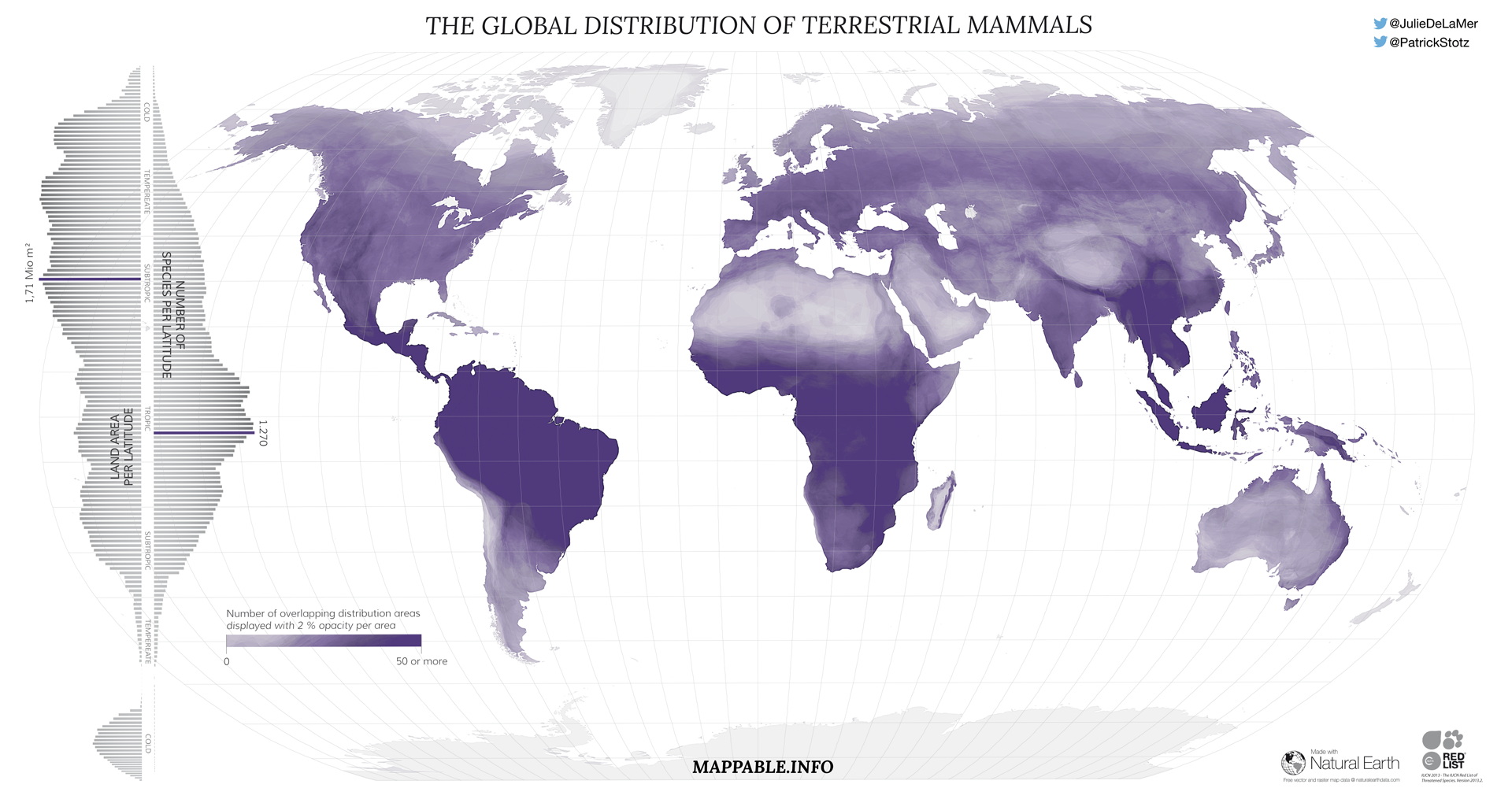
Plain and simple, the map shows the distribution areas of almost all terrestrial mammals – more than 5,000 species in total. The distribution data was obtained from the IUCN Red List of Threatened Species (which in fact lists all known mammals, classified into different categories spanning from low concern to a high risk of extinction). The map we present here is part of Julia’s data source description. We’ve simply mapped all distribution areas on top of each other with a very low opacity (2%) using QGIS. Areas of full saturation consequently have a density of more than 50 species. Only hitch was the enormous data size and processing time (e.g. to exclude extinct species and delete marine distribution areas of some terrestrial mammals, such as seals, by clipping along coastlines using Natural Earth data).
Even tough the map is rather simple and descriptive we still like it for it’s unique style. It rather has the appearance of a precipitation map than a biodiversity map.
As a little extra, we’ve calculated statistics per latitude and visualized them as bar charts with Adobe Illustrator’s graph functionality. The bars visualize the size of land area (left axis) and the number of species (right axis). It’s quite easy to spot that the highest diversity of terrestrial mammals can be found in the equatorial belt – areas with tropical climate – whereas the peak values for landmass are between 25° – 50° N.
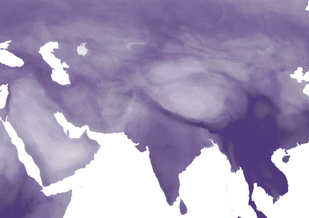
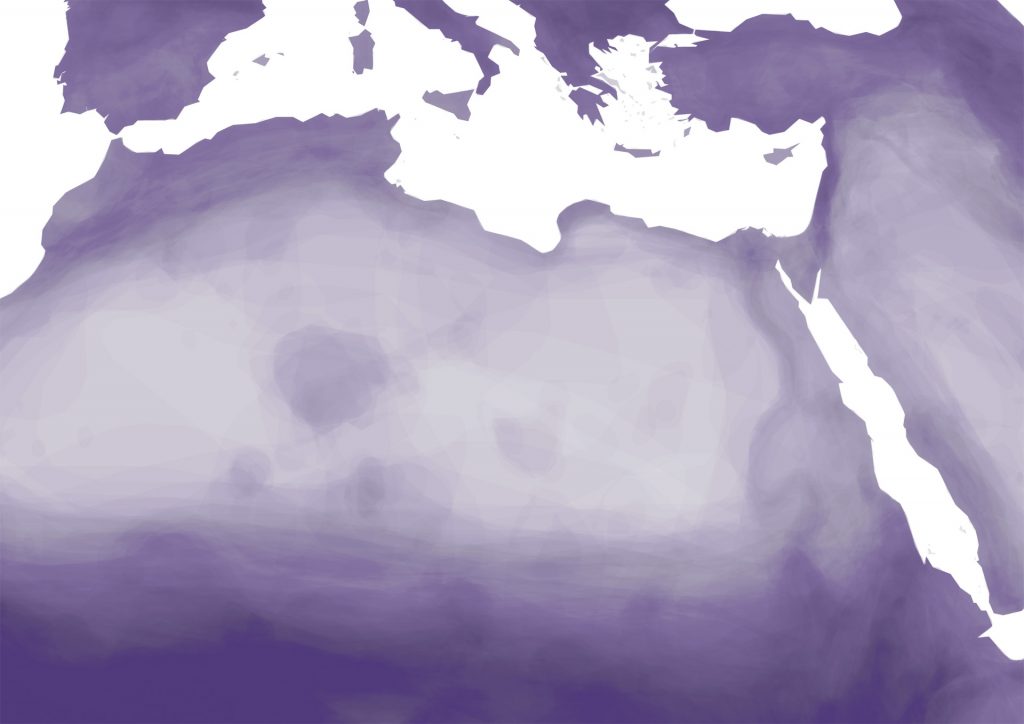
But enough text and time for some visuals. You can explore the map in a full-sized zoomable view when you click the world map image above. It’s fun to zoom in and see how diversity is changing rapidly – for example between the the Gangetic Plain, Nepal and the Himalayas. Or how the mountain range of ‘Tassili n’Ajjer’ stands out in the middle of the Sahara Dessert.