its / db mobility hackathon 2017

Our team consisting of four civity analyst took part in the DB / ITS Hackathon in Hamburg on Friday / Saturday and won the first place quite unexpectedly…

On a hackathon, a programming project / data analysis has to be developed from the idea to the prototype within 24 hours. We opted for the relatively current topic of “storm susceptibility of the rail infrastructure due to falling trees”. We used a combination of different methods and open datasets to create static and interactive maps to identify hot-spots within the German rail system in general and the Hamburg system in particular.

Storm risk analysis of the German railway system. Red and yellow lines indicate a heightened risk for trees falling onto the railway tracks.

You can find the finished project here: http://46.101.153.57/ 

Pictures and further information can be found at: https://dbmindbox.com/db-opendata-hackathons/hackathons/hamburg/

Mapping nightlife

After collecting business listings of relevant categories (nightlife, cinemas, theaters, and event locations) from a popular online directory, the requirements for mapping them were twofold:

  1. The visualizations should allow to identify hot spots of nightlife activity in each city on different map scales.
  2. They should be suitable for comparing the distribution patterns between the different cities.

We chose to tackle this challenge with static dot density maps (sometimes also called dot distribution maps), produced in QGIS. If a data set is large enough, this approach offers a much higher precission than the ordinary choropleth map or any kind of raster or hexbin map that aggregates the data. For the map styling we used cartoDB’s new Dark Matter basemap (finally a project with a good reason to chose the ever so popular dark map style) and plotted all locations on top of it. We set the circle size to 1250 meters and used a very low opacity level as well as the feature blending mode ‘screen’ to highlight those places where a lot of nightlife locations are overlapping.

You can explore the results by either browsing through the gallery on top of this blog post or, if you want to take a closer look at Berlin, Hamburg and Munich check out the high-res, zoomable maps below. As an urban planer it’s fun to see that the nightlife patterns in most cases match to the general city structure (monocentric vs. polycentric) pretty well.

Berlin

Hamburg

Munich

9 days in Amsterdam – Tracking my mobility in bicycle wonderland

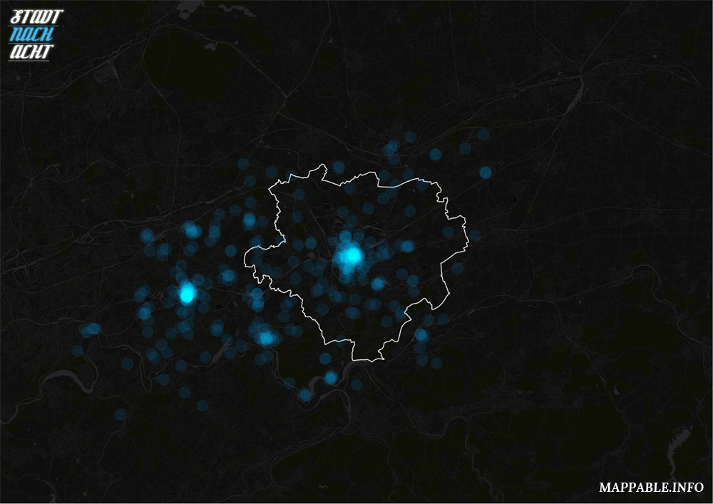
As you’ve probably read here before, I (Patrick) am currently on a cartography / dataviz journey around the world. I originally planed to do a lot of mapping during the trip, but didn’t have enough time to do so recently. Too many interesting places to visit and too many short stops so far (which will change soon).

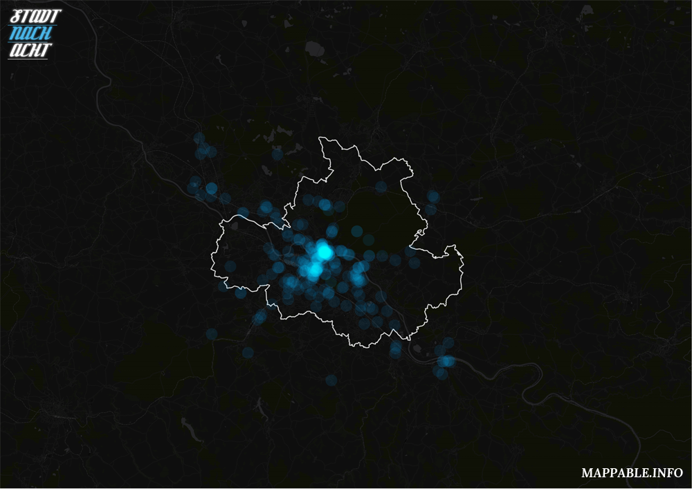
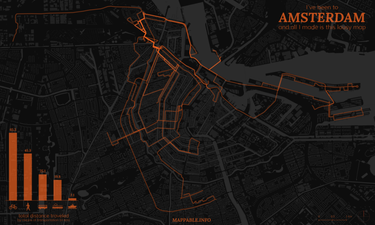
But just after spending 9 days in Amsterdam at the beginning of August, I used the bus ride to Hamburg, and a few more hours later on, for making a map of all my tracks during the stay in Amsterdam. As I didn’t have any special equipment and barely any time to get prepared, this had to work with a very simple approach. If you’re interested in a more sophisticated way of tracking your travels, take a look at Bjørn Sandvik’s blog thematicmapping.

I simply tracked my movement with a smartphone GPS and the OpenPaths service. While I had good experiences with this setup in Germany, it didn’t quite work out abroad. At that time I travelled without a data plan, which meant that my phone couldn’t make use of the A-GPS (Assisted GPS) function, which significantly improves GPS performance. What did that mean for me? Well, a lot of my position data was just useless, the GPS deviations were way too high. But I didn’t want to be stopped by that. Amsterdam and it’s channels (dutch: ‘Grachten’) just look too beautiful on a map to skip this one.

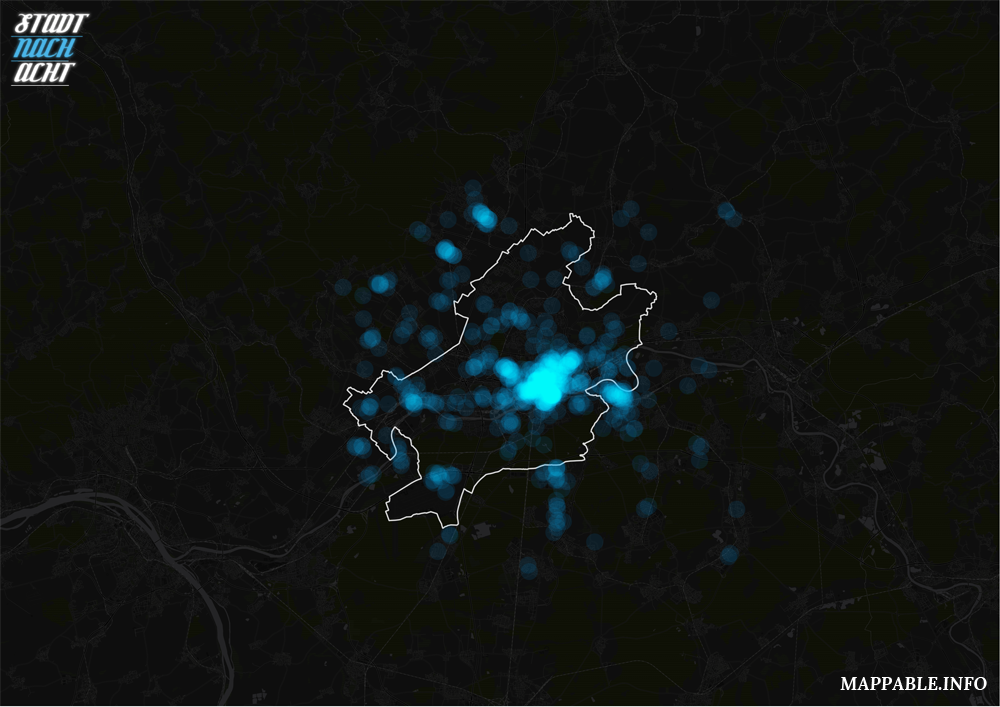
What I ended up doing, was taking the GPS positions as a starting point, made lines out of continuos points and correcting/completing them in QGIS. This took me about two hours, and while the result is not 100% precise, it’s fair enough for a few hours of work and for a first try. The next map of this kind on one of my future stops will be better and the data collection method will improve as well, I promise.

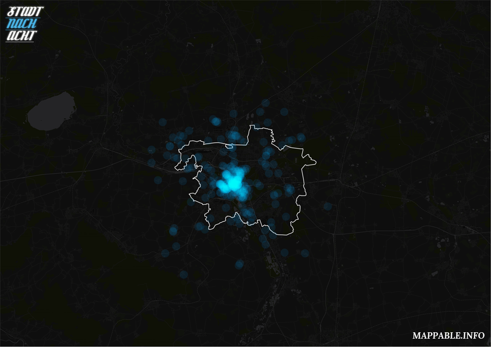
Having complete coverage of my tracks, I categorized the lines according to the means of transportation I’ve used, measured their lengths and added it up to get my personal modal split for my stay in Amsterdam. As you would expect from a city with great bicycle infrastructure, and perfect weather at that time, I ended up using the bike most of the time. For finishing my map, I left QGIS and added the chart and the title in Adobe Illustrator. You can see the final result below, or here in a high-res, zoomable view. And yes, it’s the Netherlands, so it had to be orange/oranje!

Not to forget: the individually designed basemap, with it’s buildings and channels, is based on OpenStreetMap data (© OpenStreetMap contributors), which I’ve extracted via the Overpass API and the XAPI Query Builder. OSM data is available under the Open Database License.

Health care inequality – Physician’s offices and income distribution in Hamburg

Last week the German weekly newspaper ‘Die Zeit‘ published an article on the distribution of physicians in major German cities. They used maps to show the relationship between income and physician density. Their main claim was that physicians tend to open their offices in wealthier districts.

First of all – we love the style and user interface of the article. It is really well done and the Zeit’s new customized mapbox style blends in really neat into their overall design. However we believe that the Zeit could have done better in one respect: They did not discuss the significance of the correlation between income and physicians density.

That’s why we produced this scatter plot:

Is it significant?

Yes, it is! The diagram with it’s trend line show that there in deed is a strong correlation between income and the density of physicians. Another determinant is visualized by the colors: the population density. Even though we’ve already normalized the number of physicians per capita, those districts with a higher population density still tend to have a higher density of physician’s offices. In our eyes this is the case, because those districts in general are closer to the city center and are characterized by mixed-use.

How was this done?

We had a deeper look at the Zeit website and found a JSON-file containing the information behind their interactive explorer. We extracted the locations of the physicians and joined them to a district shape with QGIS. Afterwards we used public data from the Statistikamt Nord to add income statistics. Finally, the scatterplot was realized tableau-public.

Biodiversity Mapping

The projects we’ve published so far are all visualizations and analyses of human activity, mostly on a city scale. But there are so many more fascinating data sets out there and it’s about time for us to broaden our activities. Therefore, it was a welcome opportunity to do some mapping together with Julia Griehl (@JulieDeLaMer) who is writing her master thesis on the protection of terrestrial mammal species. As a sneak preview into her work – she’s currently adding the finishing touches to her thesis – we want to share this map on mammal distribution with you:

Click on the image for a zoomable high-res version.

Plain and simple, the map shows the distribution areas of almost all terrestrial mammals – more than 5,000 species in total. The distribution data was obtained from the IUCN Red List of Threatened Species (which in fact lists all known mammals, classified into different categories spanning from low concern to a high risk of extinction). The map we present here is part of Julia’s data source description. We’ve simply mapped all distribution areas on top of each other with a very low opacity (2%) using QGIS. Areas of full saturation consequently have a density of more than 50 species. Only hitch was the enormous data size and processing time (e.g. to exclude extinct species and delete marine distribution areas of some terrestrial mammals, such as seals, by clipping along coastlines using Natural Earth data).

Even tough the map is rather simple and descriptive we still like it for it’s unique style. It rather has the appearance of a precipitation map than a biodiversity map.

As a little extra, we’ve calculated statistics per latitude and visualized them as bar charts with Adobe Illustrator’s graph functionality. The bars visualize the size of land area (left axis) and the number of species (right axis). It’s quite easy to spot that the highest diversity of terrestrial mammals can be found in the equatorial belt – areas with tropical climate – whereas the peak values for landmass are between 25° – 50° N.

But enough text and time for some visuals. You can explore the map in a full-sized zoomable view when you click the world map image above. It’s fun to zoom in and see how diversity is changing rapidly – for example between the the Gangetic Plain, Nepal and the Himalayas. Or how the mountain range of ‘Tassili n’Ajjer’ stands out in the middle of the Sahara Dessert.