‘one week of carsharing’ back online

In July 2013 we’ve released a project named ‘one week of carsharing’, for which we’ve tracked and analyzed one week of carsharing usage in 19 cities throughout Europe and North America.  

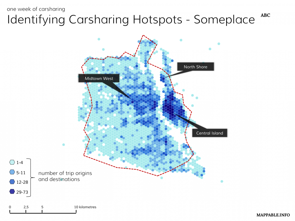
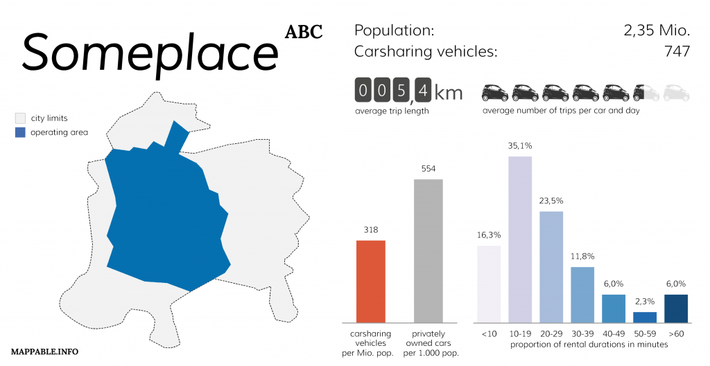
Unfortunately, just one days after the initial release of our project, in which we visualized key facts like the number of vehicles, number of trips per day and vehicle, average rental duration and maps of the spatial distribution for all cities in which car2go was operating at that time, Daimler (car2go’s parent company) requested us to take the project offline. They argued that we had violated their terms of use during the process of data collection. Since then we’ve taken several attempts to contact Daimler and find a solution in accordance with them to re-publish our project. Unfortunately their reactions were very scarce and we’ve got the impression they were just waiting it out. As a consequence we thought about a way to present our project without harming Daimler’s interests: simply by showing what we did and how the results looked like, this time not with real data but with a synthetic data set for an imaginary city.

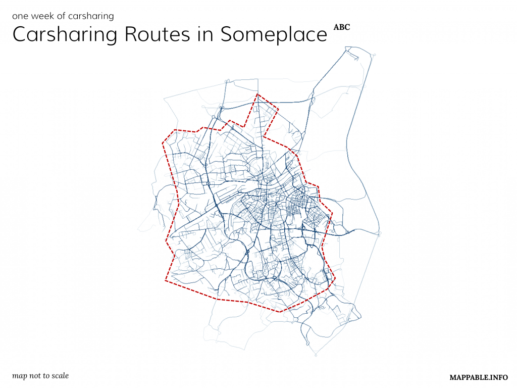
You can take a closer look at our work and the description how we realized it on our project page.

Hello World – 2nd Edition

As Patrick already wrote, I’m now officially part of mappable.info and excited about the things lying ahead. My name is Achim Tack and my professional background is quite similar to Patrick’s: just like him I’m an urban planner. I’m currently working for a small Hamburg based consulting company. I spend most of my time on research projects, especially focusing on technical and social infrastructure systems in the context of demographic change.

To me it`s all about data – ways to acquire, clean and structure it and finally draw conclusions from it. Today data is generated everywhere – from mobile phones to sensor systems for traffic control or environmental monitoring – and a lot of it is mappable. This is why I’m joining this blog.

As well as complex, long-term projects, I enjoy working on spontaneous ideas and mini projects for fun (some of them can be found on my personal website) and from today on I will publish some of them here.

mappable +1

Since today, mappable is not a one man project any more. As it is quite hard to find enough time for pushing it forward next to working full-time, I’m really happy to now join forces with my friend and colleague Achim. For more information about us and our goals at mappable see our updated about page. And the best thing is: we’ve already begun working on a really neat new project. More information will follow soon.

The future of subway station area maps

During a trip to Asia a few weeks ago I had the pleasure to spend some days in Seoul, South Korea. Even tough I knew that Korea is a very high-tech society, I was still amazed by the extend to which e.g. location based services are integrated into everyday life and used by people of all ages.

Especially an interactive, map centered information device, named ‘Digital View’, impressed me. Built around a  huge 46 touchscreen and operated by the popular Korean web portal Daum, these terminals offer probably any kind of information about the surrounding area you’ll ever need. Here’s a list of some of the available features:

  • information about news, weather, finance, etc.
  • entertainment services
  • ticketing, e.g. purchasing movie tickets
  • maps with diverse styles (road, satellite, hybrid, google Street View-like) and different layers with points of interests (shopping, accommodation, banks, real estate)
  • free phone calls
  • real-time bus schedules, subway maps and direction details

Features that make them extremely helpful for finding the fastest way through Seoul’s massive underground transportation network as well as for getting all the required information about the surrounding area.

For more details, see:

https://en.wikipedia.org/wiki/Seoul_Metropolitan_Subway

http://www.daumcorp.com/DaumEng/about/service.daum#viewd_10http://english.chosun.com/site/data/html_dir/2010/02/19/2010021900782.htmlhttp://www.advancedtechnologykorea.com/303

http://www.advancedtechnologykorea.com/303

http://english.chosun.com/site/data/html_dir/2010/02/19/2010021900782.html

similar system in NYC coming up: http://cityroom.blogs.nytimes.com/2013/04/08/new-screens-in-the-subway-will-guide-riders-and-sell-to-them-too/ 

Hello world

Welcome to my new website & blog.

I’ve always been deeply fascinated by all kinds of maps. Informative maps, beautifully designed maps, analytic maps, unusual ones…

I guess it’s the abstraction of the real, very complex, world into a simple and easily understandable visual representation that has always fascinated me. Being an urban planer / researcher I deal with maps on a regular basis. However, only in the last months it became clear to me how huge the potential of web-based mapping is. There are already so many innovative and mostly interactive maps and applications on the web, that show what can be done with the huge amount of data we’ve got nowadays. WOW, how could I have missed that for such a long time?

Anyway, now I’m just in the middle of exploring what’s out there, learning the necessary tools and of course making maps. Why? because it’s fun!

And what’s the blog for? Well, I’ll write about interesting stuff I stumble across and the hopefully numerous personal projects that are still to come.

Enjoy.