Wanderlust

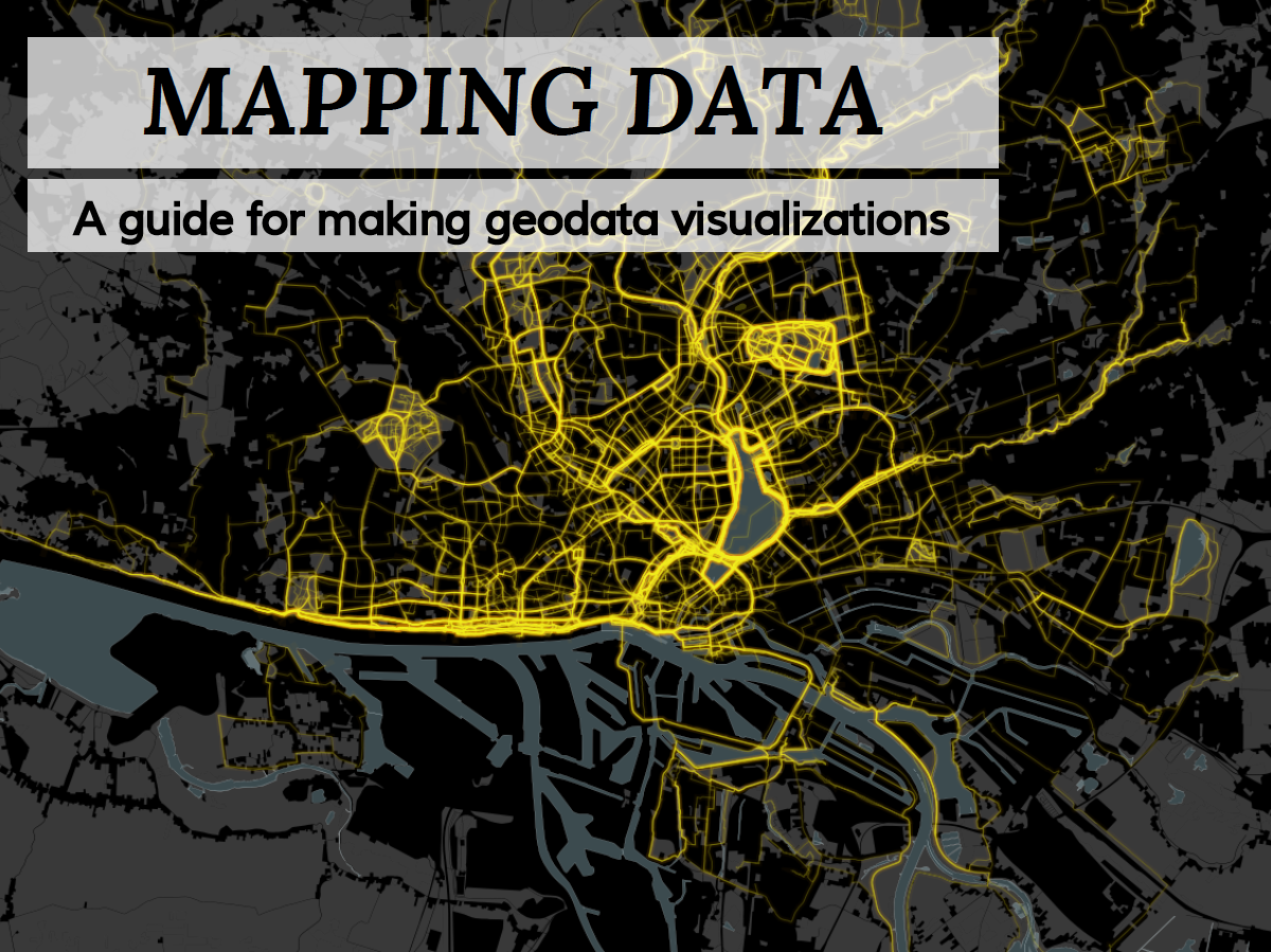
It’s been a little quiet here in the past few months, except for our activity at the “Netzwerk Recherche” conference and the corresponding blog post.
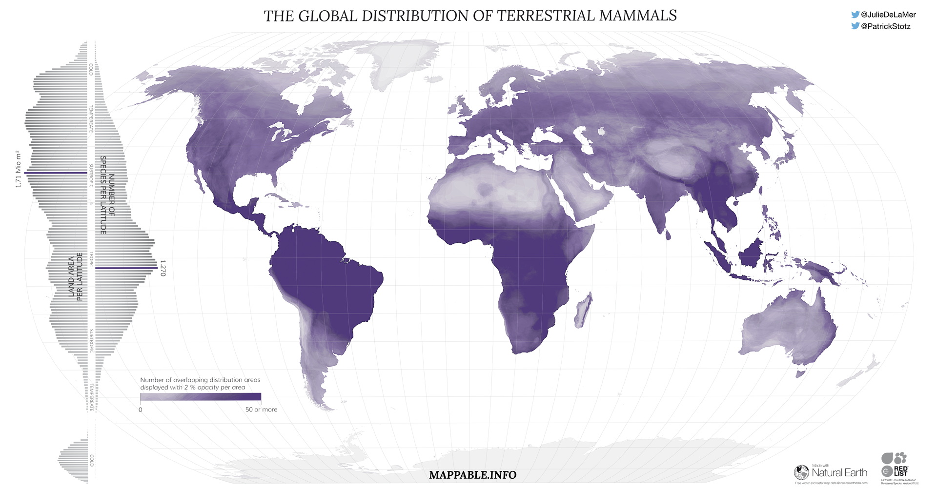
This has, at least in part, to do with my decision to become a digital nomad for an uncertain time. After quite some consideration my girlfriend and I have chosen to leave Hamburg, our apartment & our jobs behind and take a gap year to travel around the world. We are looking forward to experiencing other countries and cultures and plan to stay in different cities for 1-3 months in order to have the chance to get to know the place we’re staying at and the people living there. To travel this way will hopefully not only help us to feel at home wherever we are, but also to get in touch with the local mapping, dataviz and open data community.


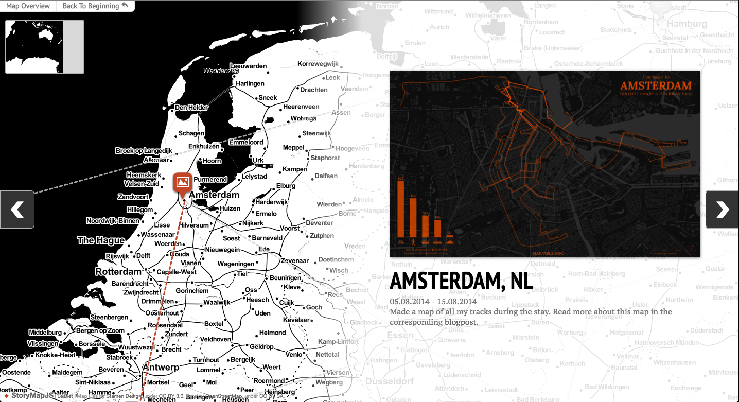
I’ll post regular updates on our travel route on twitter and in the new section called wanderlust here on mappable. If your city is on our way and there’s an interesting meetup or you’d just like to meet me for a chat about mapping, dataviz etc., just let me know. It’ll be a pleasure for me to get in contact with locals and learn as much as possible about what’s going on in other parts of the world. During the longer stops I’ll also be available for freelance jobs (got to earn some money after all). If you work on a project and need someone with the skills that we show here at mappable.info, I’d be happy to hear from you as well!
Concerning our blog, everything is going to stay pretty much the same. Despite the distance, Achim & I will continue to collaborate on projects and release them here whenever we’ve developed something worth sharing.

mappable at the nr-conference

Yesterday we’ve had the pleasure to hold a presentation at Netzwerk Recherche’s Jahreskonferenz. Germany’s most important investigative journalism conference. The aim of our session was to give guidance to (data) journalists and went by the title: “Mapping Data: So gelingen Geovisualisierungen” (“A guide for making geodata visualizations”).

You can take a look at our presentation by clicking one of the links below (we’ve made a German and an English version)

GERMAN VERSION I ENGLISH VERSION

As an add-on to our presentation we produced two more things, that some of you out there mind find helpful too:

  1. Mappable Toolset: The number of tools to process data, make maps, interactive visualizations etc. is continuously growing. While we love new tools, this leads to a situation that makes it quite hard to keep an overview of which tools are good for a certain tasks, where to find them and how much they cost. To keep track of the tools we’ve used so far and as a guide for others we thus collected our toolset. Have a look at it here: English version, German version
  2. Mappable Cheat-Sheet: Making maps and other visualizations with a geospatial component is certainly not a trivial tasks. There are many pitfalls, take alone spatial reference systems as an example, that might completely mess up your visualization if you don’t handle them correctly. We thus created a checklist for making geodata visualizations in (data-driven) journalism. You can find it here: English version, German version.

Health care inequality – Physician’s offices and income distribution in Hamburg

Last week the German weekly newspaper ‘Die Zeit‘ published an article on the distribution of physicians in major German cities. They used maps to show the relationship between income and physician density. Their main claim was that physicians tend to open their offices in wealthier districts.

First of all – we love the style and user interface of the article. It is really well done and the Zeit’s new customized mapbox style blends in really neat into their overall design. However we believe that the Zeit could have done better in one respect: They did not discuss the significance of the correlation between income and physicians density.

That’s why we produced this scatter plot:

Is it significant?

Yes, it is! The diagram with it’s trend line show that there in deed is a strong correlation between income and the density of physicians. Another determinant is visualized by the colors: the population density. Even though we’ve already normalized the number of physicians per capita, those districts with a higher population density still tend to have a higher density of physician’s offices. In our eyes this is the case, because those districts in general are closer to the city center and are characterized by mixed-use.

How was this done?

We had a deeper look at the Zeit website and found a JSON-file containing the information behind their interactive explorer. We extracted the locations of the physicians and joined them to a district shape with QGIS. Afterwards we used public data from the Statistikamt Nord to add income statistics. Finally, the scatterplot was realized tableau-public.

Biodiversity Mapping

The projects we’ve published so far are all visualizations and analyses of human activity, mostly on a city scale. But there are so many more fascinating data sets out there and it’s about time for us to broaden our activities. Therefore, it was a welcome opportunity to do some mapping together with Julia Griehl (@JulieDeLaMer) who is writing her master thesis on the protection of terrestrial mammal species. As a sneak preview into her work – she’s currently adding the finishing touches to her thesis – we want to share this map on mammal distribution with you:

Click on the image for a zoomable high-res version.

Plain and simple, the map shows the distribution areas of almost all terrestrial mammals – more than 5,000 species in total. The distribution data was obtained from the IUCN Red List of Threatened Species (which in fact lists all known mammals, classified into different categories spanning from low concern to a high risk of extinction). The map we present here is part of Julia’s data source description. We’ve simply mapped all distribution areas on top of each other with a very low opacity (2%) using QGIS. Areas of full saturation consequently have a density of more than 50 species. Only hitch was the enormous data size and processing time (e.g. to exclude extinct species and delete marine distribution areas of some terrestrial mammals, such as seals, by clipping along coastlines using Natural Earth data).

Even tough the map is rather simple and descriptive we still like it for it’s unique style. It rather has the appearance of a precipitation map than a biodiversity map.

As a little extra, we’ve calculated statistics per latitude and visualized them as bar charts with Adobe Illustrator’s graph functionality. The bars visualize the size of land area (left axis) and the number of species (right axis). It’s quite easy to spot that the highest diversity of terrestrial mammals can be found in the equatorial belt – areas with tropical climate – whereas the peak values for landmass are between 25° – 50° N.

But enough text and time for some visuals. You can explore the map in a full-sized zoomable view when you click the world map image above. It’s fun to zoom in and see how diversity is changing rapidly – for example between the the Gangetic Plain, Nepal and the Himalayas. Or how the mountain range of ‘Tassili n’Ajjer’ stands out in the middle of the Sahara Dessert.

Recruitment Events of the German Army

Ulla Jelpke, Jan van Aken and Christine Buchholz (German MPs – die Linke),  today published a document about public recruiting events of the German army. Events like this, especially if targeted on school children and teenagers, have been the subject of fierce public discussions for quite some time. 

We filtered the given information to show the location of the people attending the events and not the venue. A first look at the map shows a slight accumulation of events in rural regions (possibly related to higher unemployment rates). It would be interesting to correlate the data with other sources.

We extracted the tables from the pdf file using tabula, a helpful little tool, which lets you convert pdfs directly on your computer (great for sensitive data). The next step was to clear and categorize the data, geocode it and upload it to cartodb

The aim of this blog post is not to show you the best possible map design but to point out that with today’s tools everything is mappable – even on a very short notice: The whole process took us about 1,5 hours (so there could still be errors in the data!).

Mappable goes codefor.de

Some of you may have heard of Code for America. It’s an awesome program that encourages civic hackers, developers and designers to use their skills for the public good. Similar programs exist in several other countries – and now there is a German divison, too!
 
Mappable was excited to support the launch by organizing the Hamburg Open Data Day on February, 22 together with Marco Maas of OpenDataCity. The event was a full success with close to 30 people coding, mapping and discussing the whole day (and into the night). Some results can be found on the Open Data Day Hackdash.
 

Encouraged by the event we are now in the process of organizing a regular monthly meetup and forming an ‘OK Lab Hamburg’ (equivalent to the Code for America Brigades). The first one will take place on April 7. So drop by if you’re in town.