The potential of phone directories for urban analytics

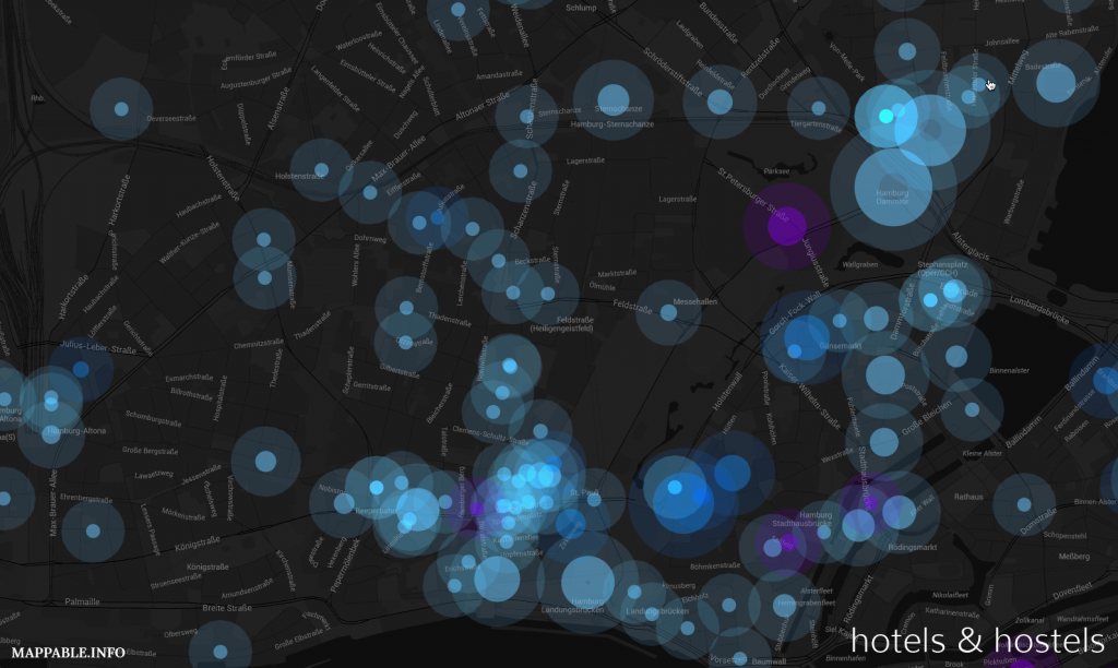
One of our main interests at mappable is to find creative ways to use (geo-)data for mapping urban dynamics. In our newest project we will explore how phone directories can serve as a data source for various analytical tasks, starting with urban migration patterns. 

For this purpose we bought German CD-ROM phone directories for the years 2004 – 2012 and exported all datasets for Berlin. We subsequently identified approximately 50.000 individual intra-city relocations and started to visualize and analyze the derived migration data. The first result of our work is an interactive, explorative visualization that let’s you explore Berlin’s intra-city migration patterns with high spatial granularity. You can take a closer look at it and explore the dataset on your own by clicking on the image bellow.

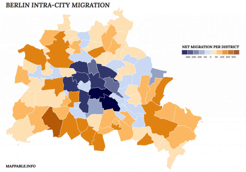
The migration patterns generated with our approach resemble those of the city’s official migration statistics. Thanks to the fact that our raw data are addresses, we are even able to analyze intra-city migration on a more detailed level than with the officially released data, which is aggregated to the county (‘Bezirk’)-level. 

To sum things up: we are quite enthusiastic about the potential of phone directories as a data source and there are definitely more research questions that can be answered with these data sets besides only migration patterns (e.g. monitoring gentrification processes, identifying ethnicity patterns).
We will continue to publish short updates about this project here on our blog. If you want to take a more in depth look, see our project page, where you can find some words on how we processed the data, created the visualization and how we interpret the migration patterns we’ve found.

‘one week of carsharing’ back online

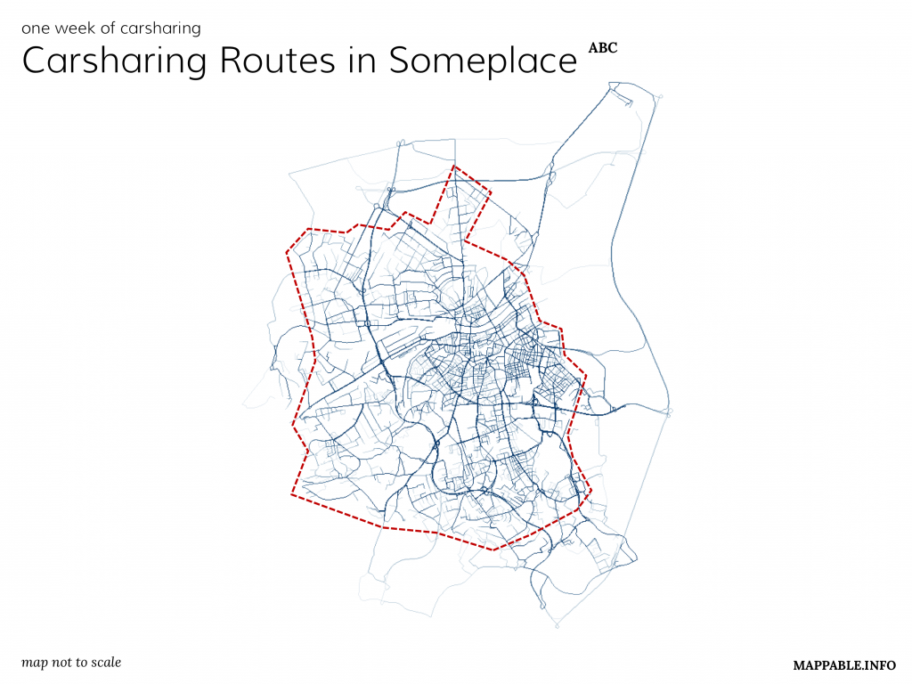
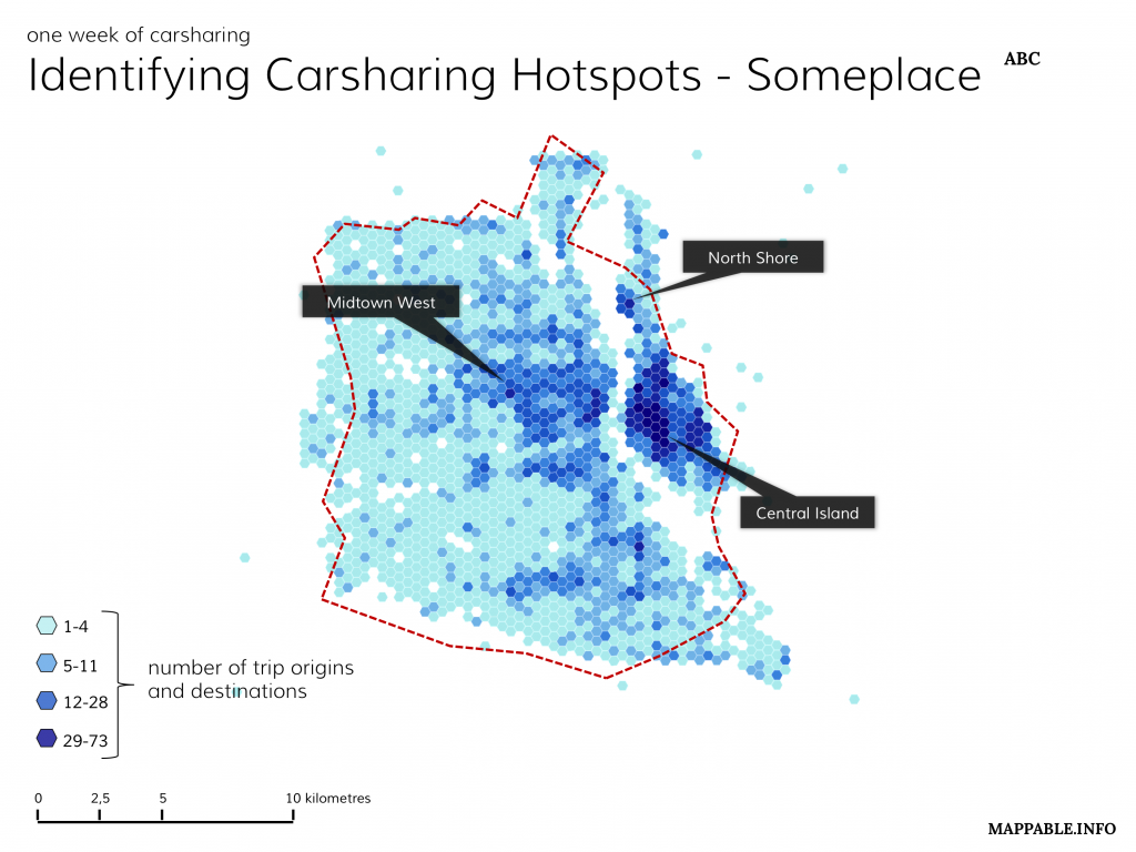
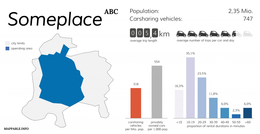
In July 2013 we’ve released a project named ‘one week of carsharing’, for which we’ve tracked and analyzed one week of carsharing usage in 19 cities throughout Europe and North America.  

Unfortunately, just one days after the initial release of our project, in which we visualized key facts like the number of vehicles, number of trips per day and vehicle, average rental duration and maps of the spatial distribution for all cities in which car2go was operating at that time, Daimler (car2go’s parent company) requested us to take the project offline. They argued that we had violated their terms of use during the process of data collection. Since then we’ve taken several attempts to contact Daimler and find a solution in accordance with them to re-publish our project. Unfortunately their reactions were very scarce and we’ve got the impression they were just waiting it out. As a consequence we thought about a way to present our project without harming Daimler’s interests: simply by showing what we did and how the results looked like, this time not with real data but with a synthetic data set for an imaginary city.

You can take a closer look at our work and the description how we realized it on our project page.

new project: the geography of nonvoters

The German election campaign steps into it’s final phase. On September 22th the Germans will elect their new Parliament.

During the weeks before the election maps, graphics and data visualizations are probably more widespread in the media than at any other time. Consequently there’s a peak in the demand for data driven journalism every four years. We want to contribute to the coverage and therefor release a map that focuses on one single aspect: the nonvoters of the last federal election.

The basic idea behind our map is to raise awareness to the number on nonvoters by visualizing turnouts for certain areas in another way than by the ordinary choropleth map. Our focus is not on the percentage of nonvoters but on the sum and spatial distribution of individual persons that did not vote.

That’s why we chose to use a dot density map, displaying one point for every ten nonvoters during the 2009 election. For our home state Hamburg we were able to get more detailed data and realized a second version with higher zoom levels, displaying one point for every single nonvoter. Of course the points do not represent real persons and their home address. Moreover, the exact location of every point was determined by a random distribution of all nonvoters in each district. For a closer & interactive look at our maps, as well as on how we realized them, take a look at our project page. 

mapping all airbnb listings in Hamburg

So far, our mapping tourism project visualized the spatial patterns of tourism in Hamburg by showing all hotels & hostels. But even when we only look at the places where tourists stay, this view is incomplete. Holiday rental accommodations and camp sites for example could also be considered – and of course there are online marketplaces / community platforms like airbnb. They bring together hosts and guests and thereby offer a completely new way to explore a destination. Having stayed in great airbnb apartments in Switzerland and China, meeting wonderful people, I’m personally a big fan of this concept.

At the same time the hotel business is not amused about their new competitor. Whereas around 1,000 accommodations with a capacity of approx. 2,500 beds is a quite moderate number compared to more than 50,000 hotel beds in Hamburg, the situation in other cities (e.g. Barcelona with more than 11,000 airbnb listings) is different.

But how about the spatial distribution of those accommodations? Are there similarities to the patterns of hotel locations or do airbnb listings show different agglomerations? 
 
To explore these questions we’ve collected location data for every airbnb accommodation in Hamburg and visualized it on an interactive map, using cartoDB once again. We’ve slightly modified the style of our hotel map and used different colors and another basemap this time (mainly because we really love the stamen toner map). Of course this relatively abstract kind of visualization, using effects like transparency and overlay, doesn’t produce a very clean look, but it might help to identify patterns. Take a look and explore the airbnb hotspots in Hamburg here: (for full screen click here)

But how about the direct comparison: patterns of hotels vs. pattern of airbnb accommodations? 

Let’s take a closer look (this time working with the same map style in both cases) at Hamburg’s most touristy areas.

  • The Reeperbahn (bottom centre of the image) is Hamburg’s famous amusement district. It offers a wide range of bars & clubs, hosts the red light district and seems to offer a concentration of hotels as well as airbnb accommodations.
  • Totally different is the situation at Sternschanze (top centre of the image, use the arrows to change between the two images). The close-by neighborhood is a residential area which in recent years more and more developed into a tourist destination with a huge variety of bars, restaurants and fashion stores. While there are hardly any hotels to be found, there’s a strong agglomeration of airbnb accommodations. 

In our opinion this distribution can be explained by the following:

  1. Sternschanze is Hamburg’s ‘hipster district’. It’s only logic that we see the highest agglomeration of airbnb listings in an area that’s especially popular with young people that frequently use social networks and the like.
  2. A system like airbnb can easily adopt to changing preferences of tourists (to be more precise, it’s of course not airbnb itself that acts, but the collectivity of apartment host). Providers like airbnb thus benefit from an accommodation demand gap in quarters with limited space for new building projects whereas tourists benefit from the adaptability of these platforms.

Adding legends to CartoDB maps

Today I want to write a few words about recent improvements of CartoDB maps. For those of you, who don’t know what CartoDB is good for: it is, at least in my eyes, the easiest and most intuitive framework for mapping and publishing spatial data online. For more detailed information take a look at their website and the awesome tutorial section.

Since the release of CartoDB 2.1 around a month ago there are some neat new features like multilayer support and legends. The whole package seems to evolve from a quick visualization tool to a different kind of web GIS environment (without looking ugly or having a confusing user interface). It goes without saying, that adding legends is a key feature to any mapping framework and we’ve been waiting for this feature ever since working with cartoDB in our Mapping Tourism project. Adding legends to our maps just took me some minutes yesterday. Currently the styling options are still limited, but they’ve announced further improvements and full HTML customization for the coming months.