Mappable goes codefor.de

Some of you may have heard of Code for America. It’s an awesome program that encourages civic hackers, developers and designers to use their skills for the public good. Similar programs exist in several other countries – and now there is a German divison, too!
 
Mappable was excited to support the launch by organizing the Hamburg Open Data Day on February, 22 together with Marco Maas of OpenDataCity. The event was a full success with close to 30 people coding, mapping and discussing the whole day (and into the night). Some results can be found on the Open Data Day Hackdash.
 

Encouraged by the event we are now in the process of organizing a regular monthly meetup and forming an ‘OK Lab Hamburg’ (equivalent to the Code for America Brigades). The first one will take place on April 7. So drop by if you’re in town.

What’s your Travel Score?

Today we’re releasing a new project: Travel Score. It’s an interactive map which, by selecting those areas of the world that you’ve visited, calculates how much of the earth you’ve already explored.

The geographic data, gathered from Natural Earth & SEDAC/CIESIN, was processed in QGIS and finally visualized in D3 for making everything interactive. The project page includes a detailed description of the way everything works and how I’ve built the map as well as some words about the dataviz / cartography journey I’m currently planning. Or if you, like most of the people on the web, are just interested in the fancy, interactive content, take this shortcut to reach the full-sized, interactive version of the map or simply click on the image.

The limited accessibility of public transport

Taking the tube or suburban railway for your daily commute is quite comfortable if you live in a city with a well developed public transport network. But as so often in life we quickly take things for granted and tend to forget that such amenities are not accessible for everyone. And I’m not referring to people living in cities without efficient public transport, but those who are, due to limited mobility, not able to use parts of the public infrastructure. Even though there certainly have been a lot of improvements in the accessibility of public transport stations during the last decade or two, there are still far too many stations in almost any bigger city which are not accessible for someone who is e.g. in a wheelchair. And even if there are big efforts to improve the situation, very old stations in densely populated areas just make the construction works very complicated and costly.

We are all disabled – sometime or another

Fortunately there are projects like Raul Krauthausen’s phenomenal wheelmap, which collects accessibility details for all kinds of points of interests by crowdsourcing and maps them on top of an OpenStreetMap base layer. He states that everyone is certain to be in need for a barrier-free environment sometime or another: Whether you are sitting in a stroller as a baby, using a wheelchair or crutches when injured, or a walker as an elderly. 

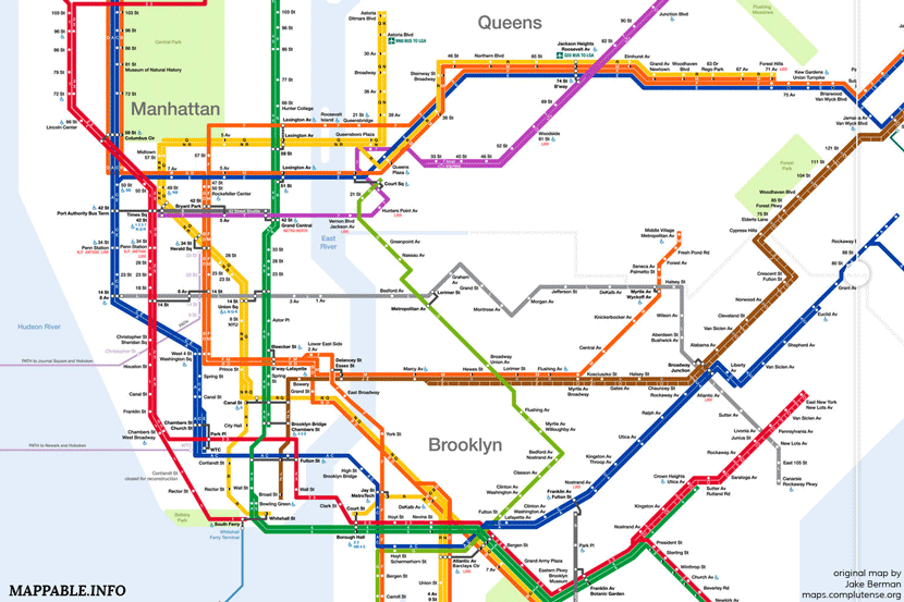
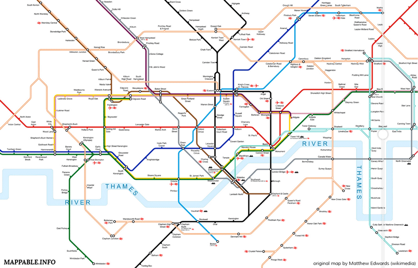
While this and other tools help to improve the situation of handicapped people, we nevertheless think that from time to time it’s useful and necessary to remind ‘the public’ about the limitations of ‘public transport’. In order to do so we chose a quite simple approach and remapped the public transport network in Hamburg, London and New York together with Julia Griehl (@JulieDeLaMer). 

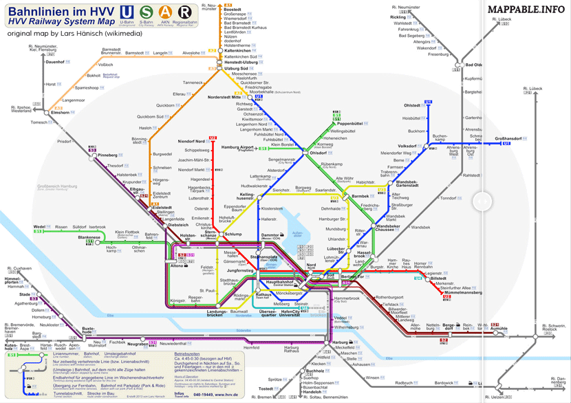
How did we do this? Well most public transport networks publish maps which quite clearly symbolize the accessibility of every station. Our approach was to take open licensed versions of these maps and remove the name of every station which is not marked as wheelchair accessible (we used information from the official maps to identify them – knowing that each city might have a different definition of accessibility). The results are maps which show how thinned out those networks suddenly look from the perspective of a handicapped person. Just click on one of the animated images to get to a larger view with an interactive slider to swipe between the two maps.

Create a map for your city!

For those of you who are interested in the techniques involved in creating these maps or want to draw your own map for the city you live in, here’s how it’s done:

First you need a map of the chosen transit network with a license that let’s you modify it and publish your work. Finding such a map might already be the hardest step, as the official maps mostly are released under quite restrictive copyright (looking at you, London!). You therefore need to be lucky to find an alternative version released by someone who put quite some effort in drawing his/her own version. Probably the best place to search for such maps is wikimedia commons. In our case we used the maps of Lars Hänisch, Jake Berman and Matthew Edwards. Thanks a lot for making those maps and releasing them under open licences!

Next, we suggest to look at an official map in order to identify stations indicated as accessible. You can use the drawing software of your choice to remove the names of those stations that are not accessible. We used Adobe Photoshop and Illustrator (for bitmap- or vector-images respectively) but any other drawing tool will be just fine too. Additionally, we altered some map details (e.g. removed unnecessary labels, changed some colors and stroke-widths) to improve the readability, but that’s an optional step. 

To get this fancy visual diff view there’s the jquery-plugin TwentyTwenty. Just as the maps, this little piece of software is released under an open license and requires only a few very simple steps to setting everything up. It won’t be a challenge for you, even if you’re not familiar with coding and there are step-by-step instructions to be found here.

Finally, if you want to publish your results to the web, you need some webspace. There are tons of possibilities to do this. If you are not familiar with this kind of stuff, check out the options dropbox has to host your own website. It might not be very professional – but hey, it’s for free and it works reliably. We use it too, if we want to publish content which conflicts with the content-management-system of Squarespace (our hoster). (We’ve switched to github pages in the meantime)

Join the Open Data Day 2014

If you like these maps and want to produce some of them on your own, or you have other ideas what could be done with open data, why not join in on the Open Data Day at February, 22nd? There are going to be meet-ups with friendly people who do awesome stuff with public data in many different cities all around the world. If you want to join us in Hamburg, you’re welcome and can find all the necessary information here
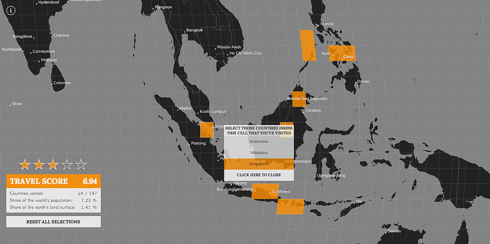
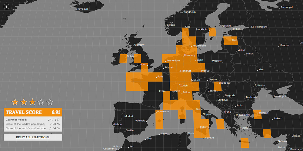
The potential of phone directories for urban analytics

One of our main interests at mappable is to find creative ways to use (geo-)data for mapping urban dynamics. In our newest project we will explore how phone directories can serve as a data source for various analytical tasks, starting with urban migration patterns. 

For this purpose we bought German CD-ROM phone directories for the years 2004 – 2012 and exported all datasets for Berlin. We subsequently identified approximately 50.000 individual intra-city relocations and started to visualize and analyze the derived migration data. The first result of our work is an interactive, explorative visualization that let’s you explore Berlin’s intra-city migration patterns with high spatial granularity. You can take a closer look at it and explore the dataset on your own by clicking on the image bellow.

The migration patterns generated with our approach resemble those of the city’s official migration statistics. Thanks to the fact that our raw data are addresses, we are even able to analyze intra-city migration on a more detailed level than with the officially released data, which is aggregated to the county (‘Bezirk’)-level. 

To sum things up: we are quite enthusiastic about the potential of phone directories as a data source and there are definitely more research questions that can be answered with these data sets besides only migration patterns (e.g. monitoring gentrification processes, identifying ethnicity patterns).
We will continue to publish short updates about this project here on our blog. If you want to take a more in depth look, see our project page, where you can find some words on how we processed the data, created the visualization and how we interpret the migration patterns we’ve found.

‘one week of carsharing’ back online

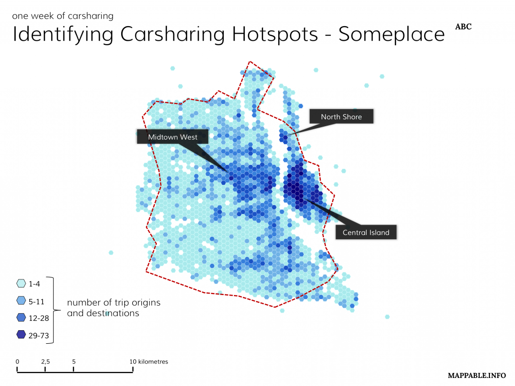
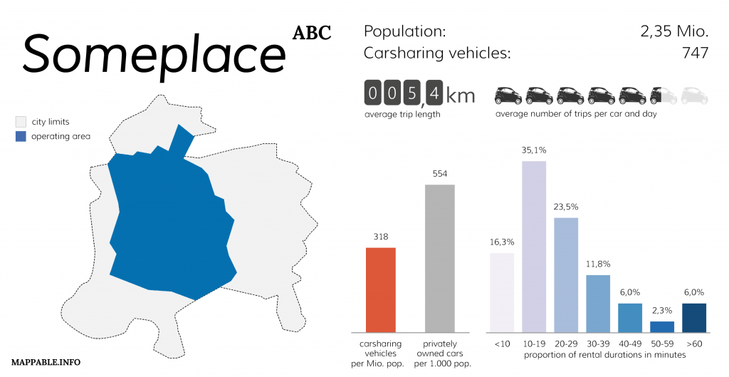
In July 2013 we’ve released a project named ‘one week of carsharing’, for which we’ve tracked and analyzed one week of carsharing usage in 19 cities throughout Europe and North America.  
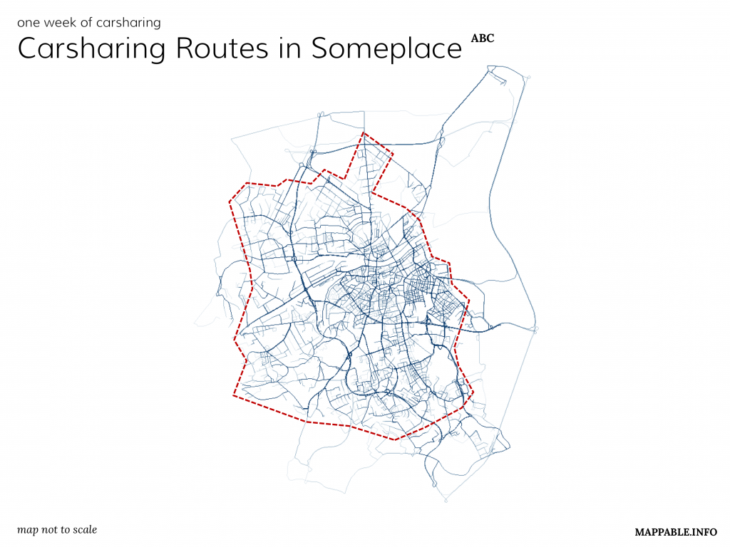
Unfortunately, just one days after the initial release of our project, in which we visualized key facts like the number of vehicles, number of trips per day and vehicle, average rental duration and maps of the spatial distribution for all cities in which car2go was operating at that time, Daimler (car2go’s parent company) requested us to take the project offline. They argued that we had violated their terms of use during the process of data collection. Since then we’ve taken several attempts to contact Daimler and find a solution in accordance with them to re-publish our project. Unfortunately their reactions were very scarce and we’ve got the impression they were just waiting it out. As a consequence we thought about a way to present our project without harming Daimler’s interests: simply by showing what we did and how the results looked like, this time not with real data but with a synthetic data set for an imaginary city.

You can take a closer look at our work and the description how we realized it on our project page.

nonvoters 2013

We’ve received a lot of (mostly positive) feedback for our last project “Atlas der Nichtwähler / The Geography of Nonvoters” which visualized the spatial distribution of nonvoters for the German federal election in 2009.

One weakness of the presentation was the lack of information about the relative number of nonvoters for each voting district. Basically, by mapping every nonvoter we produced a map which looks almost the same as a visualization of the current population density.

As a consequence we’ve decided to vary the style of our map for the results of the 2013 election by additionally displaying the percentage of nonvoters for each district by diverging colors.

The results are quite interesting: More than two decades after the reunification there is still a significant gap between voters in the eastern and western parts of Germany. Especially rural parts of eastern Germany have a considerably low turnout. This is sad but in no way surprising given their demographic, economic and social situation. The refusal to cast a vote is directly connected to factors like wealth and education. The suburban regions around cities like Berlin, Hamburg or Munich therefore show higher turnouts.

Interesting and somehow surprising is the fact that some counties in Bavaria had quite low turnouts as well. Maybe voters were overly convinced that the CSU-party (who received over 50 % of the votes in Bavaria) would win anyway.